Day 4 - Observing the outputs of the nf-core/differentialabundance pipeline and further analyses
Recap from Day 3
- Yesterday we covered:
- How to check the quality of the rnaseq data that we processed.
- How to find the relevant outputs.
- How exececute the differentialabundance pipeline.
Outputs from the differentialabundance pipeline
- We should all have had an email from SCW HAWK - HPC SERVICES notifying you of a successful pipeline run.
- Sometimes the email function doesn’t work. We can just log in and check ourselves.
- To check, we need to log back onto HAWK, load the tmux module, and then open the session that we created.
Log on to HAWK
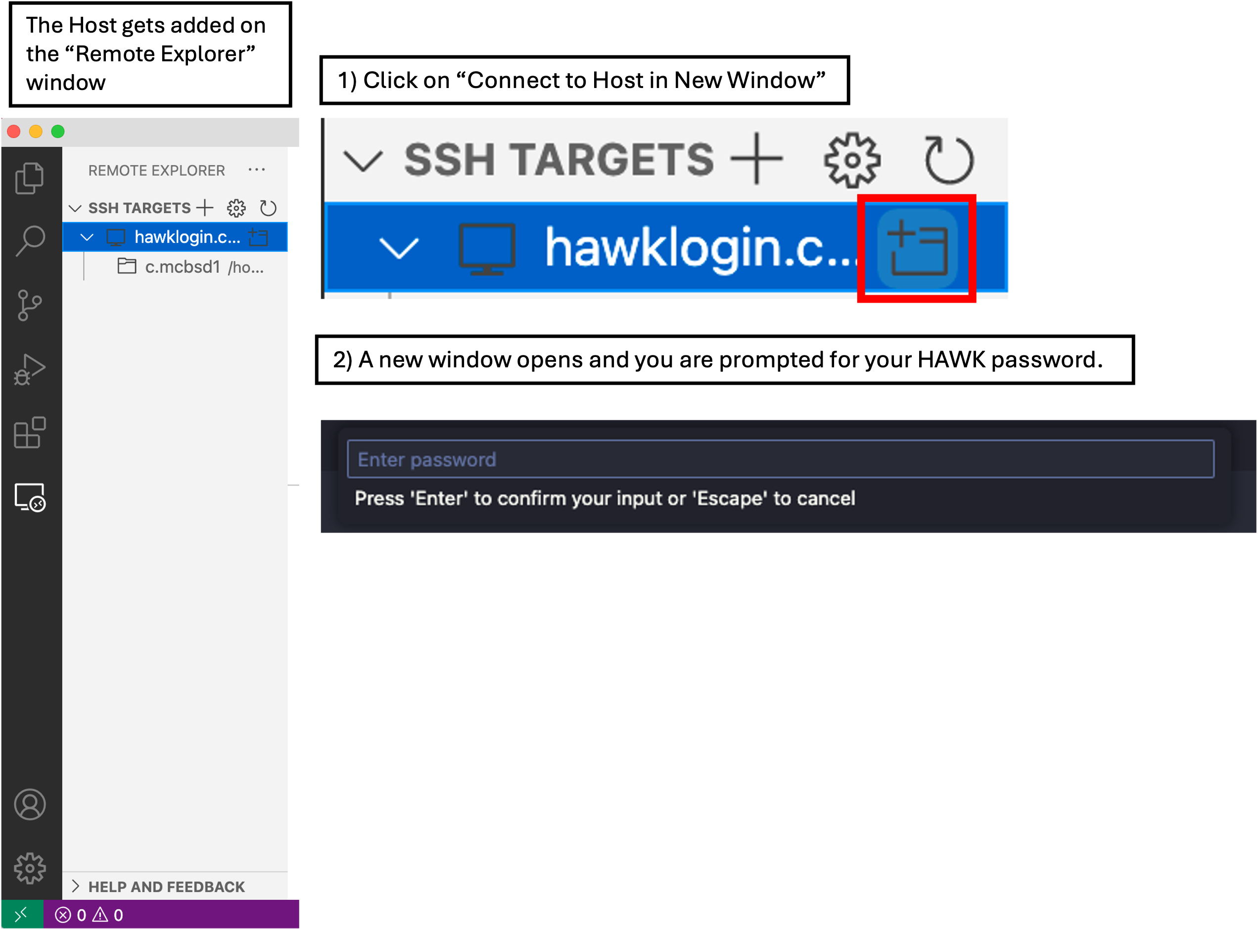
- In VSCode, click on the ‘Remote Explorer’ button, then click ‘Connect to Host in New Window’ button. This opens a new VSCode window with the remote host.
- You will be prompted (top box) to enter your password. Do this and hit enter.
- You are now connected to HAWK.
- Click on ‘Explorer’ and then ‘Open Folder’.
- A drop-down box appears at the top of the screen with a filepath. We need to change this to
/scratch/c.c1234567/nfcore-rnaseqand then click ‘OK’. - You may be prompted ‘Do you trust the authors this folder?’. Click ‘Trust all authors’ or ‘Yes’.
- You will now see that the directory will be open on the left of the window.
- Click on ‘Terminal’ at the top of your screen and select ‘New Terminal’.
- In the terminal window at the bottom of your screen, paste the following:
# log onto cla1 node
ssh cla1

# load tmux
module load tmux

# open our tmux session
tmux attach -t diff-abundance
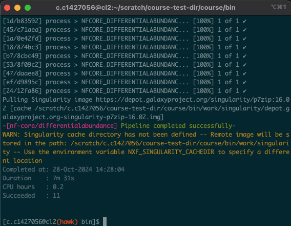
- Upon opening the session, we should have a window that looks like this:
Linux Users
# log onto HAWK
c.c1234567@hawklogin.cf.ac.uk
PASSWORD

# log onto cla1 node
ssh cla1

# move to the working directory (scratch)
cd /scratch/c.c1234567/nfcore-rnaseq

# load tmux
module load tmux

# open our tmux session
tmux attach -t diff-abundance
- In this situation, the process took around 8 minutes. As all of us were using the pipeline at the same time, these times will likely vary. Download times will also depend on the size and number of files being downloaded.
- You will also notice the following message: “Merged table created with annotations » saved to ‘merged_table.tsv’.
- At the end of the differential abundance script, we tell HAWK to run another script that I have created that merges the output tables. This will make our lives easier when it comes to playing around with the differentially expressed genes.
Report directory
- This is where the main reporting output of the workflow is stored.
- Here we can find the report webpage (.html) and a zip file containing an R markdown file with all of the parameters to customise the reporting.
Plots directory
- Here we can find all of the stand-alone plots generated by the pipeline.
- Most of these plots are included in the webpage report.
- Plots include:
- QC: quality control plots from initial processing.
- Exploratory: boxplots, PCA plots, correlation and dendograms. These are all plots that can be used to abundance distributions, sample clustering/correlations and observe any outliers.
- Differential: volcano plots showing DEGs.
Tables directory
- This is where we can find the tables containing the count data:
- Annotation: annotation matrix.
- Processed Abundance: processed abundance values from initial processing. i.e. normalised counts from DESeq2.
- Differential: Results of diferential analysis. filtered and unfiltered tables for expression.
- We will also find ‘merged_tables.tsv’, the table that we generated at the end of the pipeline. This takes all of the tables and combines them into one.
Pipeline Information directory
- This directory contains all the files relevant to the pipeline that was run, such as a nextflow report, pipeline report.
- These files can be used to make a report if needed (handy when writing methods section).
- We don’t need any of these files for the next stages.
ShinyNGS App directory
- This is where you will find the relevant files to run the Shiny app in R.
- We will cover how to run this below.
So we’ve processed the samples and run the analysis pipeline… Now what?
- Now we can start exploring the data and begin answering our hypotheses.
- There are multiple things that we can do and multiple places we can start.
- I would highly reccommend that we start with the webpage report to have a general overview of the outputs.
- From there, we can then look at the Shiny app and use the built-in tools and filters to start exploring the data.
- We can then run additional analyses, such as Gene Set Enrichment Analysis (GSEA), Ingenuity Pathway Analysis (IPA), and further enrichment analysis tool on various web-tools.
Webpage Report
- Lets start with the webpage report.
- Navigate to
output/report/study.htmlusing ‘Explorer’. -
Right click on the file and select ‘Open Preview’. This will load the webpage in a preview window on your VSCode.
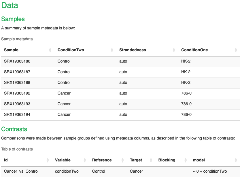
- The report contains all of the information about the differentialabundance analysis performed.
- At the top, we can see information about the Dataset, such as the sample name, strandedness and the condition columns that we added. Note that here I have a second condition column to bin the samples into cancer and control.
- Below this, we also have the contrasts table, indicating what contrasts we made. Note again here that I used the conditionTwo column to compare the Cancer samples to the Control samples.
Results section
- This is where all of the plots and data are presented.
Counts
- Tells us how many input genes we had, and how many we had after filtering for low abundance.
Exploratory analysis
- Shows us a range of plots that allow us to explore the data.
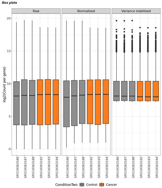
Box plots
- show us the distribution of abundance values across the samples.
- Here we can see that we have 3 plots, one for each data type. We can see that normalisation and variance stabilisation has done a good gob. The purpose of this process is to adjust for differences in sequencing depth, control for different library sizes, minimize technical variability, and stabilise the variance across read counts.
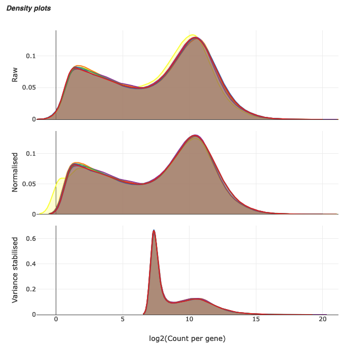
Density plots
- Give us an idea of overall expression levels across the dataset. Again, this section shows us the density plots across the 3 different data types.
- From the top 2 plots, it would be difficult to determine what is considered ‘normal’ expression here, as we have a lot of expression across the board. The point of normalisation and variance stabilisation is to make this easier to determine what is considered ‘normal’ expression and what is considered over expressed.
- We can see that in the variance stabilised plot, most of our genes are lowly/normally expressed (as indicated by the high peak on the left) and then we have a lwoer number of genes that would be considered over expressed.
sample relationships
- Here we will find PCA plots, Scree plots, association plots, dendrograms, and outlier detection plots.
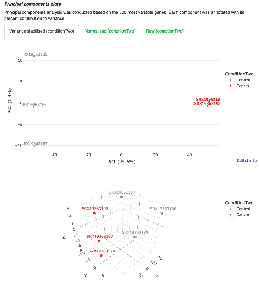
PCA
- Plots show us how the samples cluster together. We can use this to see how similar or different samples are to eachother.
- The analysis is performed by using the top 500 most variable genes.
- We can see here that the Cancer samples (786-0) tightly cluster together on both PC1 and PC2 axes, whereas the Control samples (HK-2) are not so tightly clustered.
- However, there is a clear distinction between the two groups which is important when we are performing out differential analyses. We should see that there will be a higher number of differentially expressed genes in this analysis as theres a better separation between the groups.
- If we were to compare groups that didn’t have a distinct separation, we would expect to see a lot less DEGs. We can also use this as an indicator of experimental conditions or techniques.
- If one sample in condition A is clustering with the samples in conditon B, was there a chance that somebody mislabelled the sample?
- If you drugged the same cell line for 1 hour and then compared drugged vs untreated, we would expect there to be very little difference between the groups and subsequently cluster close on a pca.
- When we look at the 3D PCA plot, where we are adding PC3 into the mix, we can see that there is more spread amongst the groups, but still a distinct separation between them.
Scree plots
- Show us the percent of variance that is explained by each principle component. We typically get most variance explained by PC1 and PC2, and then less and less explained by the latter PCs.
- We don’t really need to pay any attention to this plot.
Association plot
- Shows the association between the principle components and the categorical covariates.
- I have not looked at this plot before, so can’t comment much on it. I think this plot could potentially show more meaningful data if we had multiple conditions and we wanted to delve deeper into the PCA analyis.
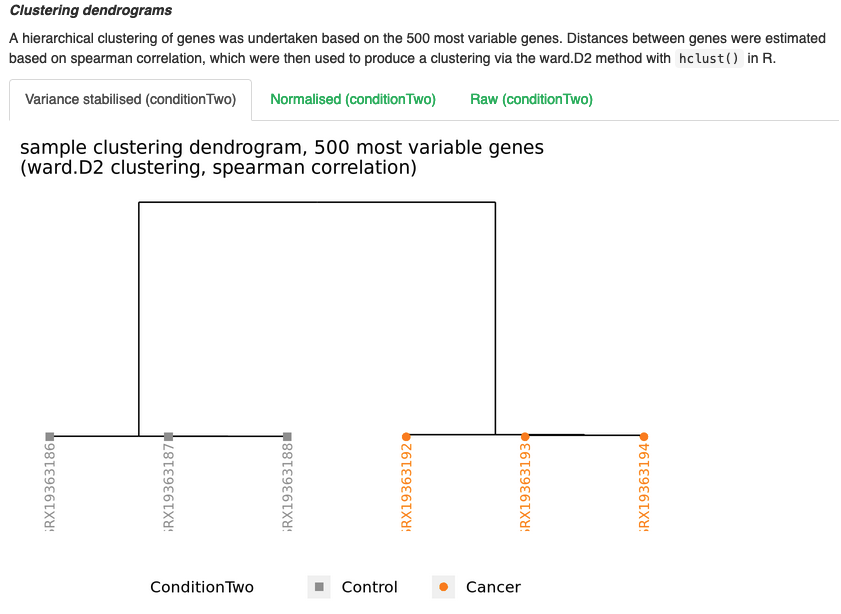
Dendrogram plots
- Show us, similar to PCA, how the samples cluster in relation to eachother.
- Like the PCA plots, we can see that each group cluster togeher and are clearly separated from each other.
- These plots can be handy to identify any potential outliers, as you will see them cluster apart from their respective groups.
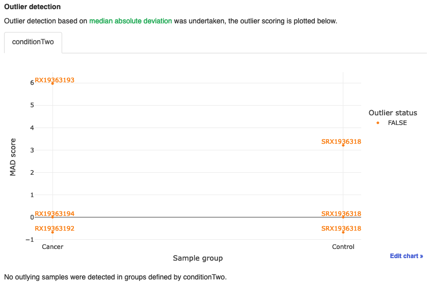
Outlier detection
- Plot is a handy plot that performs an analysis that can attempt to detect outliers in the dataset.
- As we can see, all samples come up as FALSE, indicating that none are classed as outliers.
Differential analysis
- This is where we can find the data related to the differential gene analysis.
Differential gene counts
- Table shows us the number of up and down DEGs for the adjusted and unadjusted p-value tables.
- When working with RNAseq data, we work with adjusted p values. Here, we can see that we have 3788 up and 4617 down significant DEGs.
- We can visualise these via the volcano plot below the table. We can use our mouse to hover over each point to show us what gene it is also.
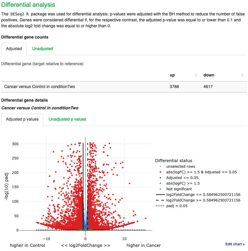
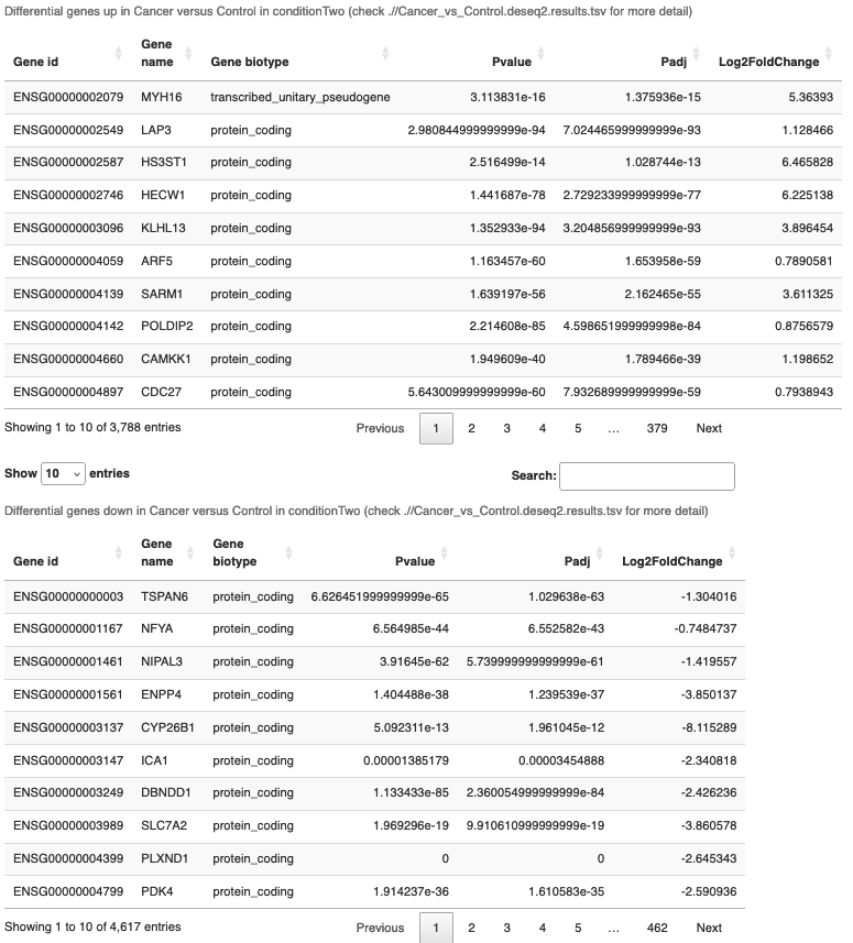
- Below the volcano is the up and down DEG tables.
- Then we have the methods section, where you will find all the filters and information about the pipeline.
ShinyNGS App
- Now we can use the ShinyNGS app and start playing with the data.
- To use the app, we will be using arrca open OnDemand. This is a webpage where we can request the supercompute resources to run an R session, which saves us having to download R onto our PCs.
- Paste this link into your web browser and log in using your SCW account details: https://arcondemand.cardiff.ac.uk/
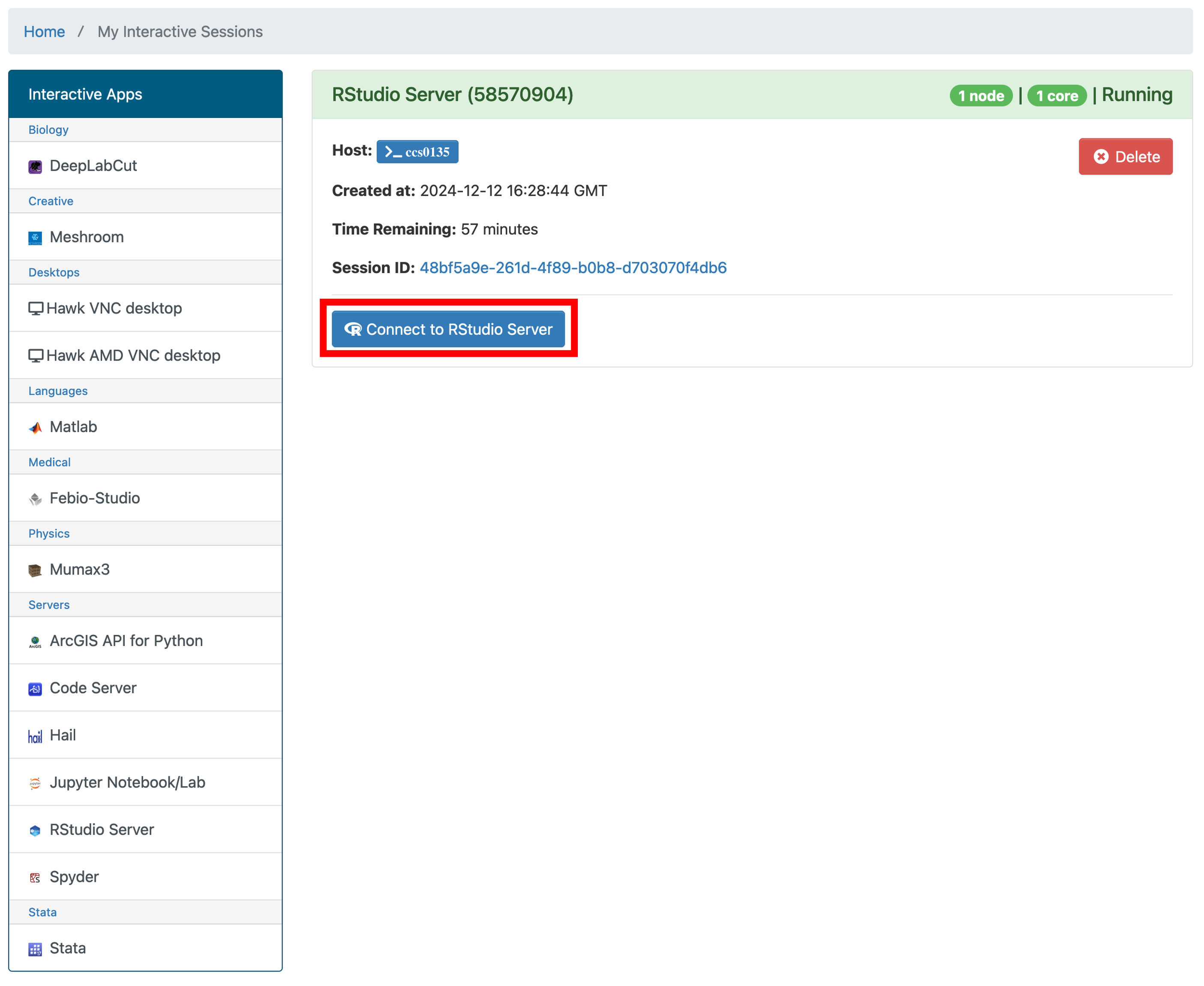
- Now click ‘Interactive Apps’ and select ‘RStudio Server’
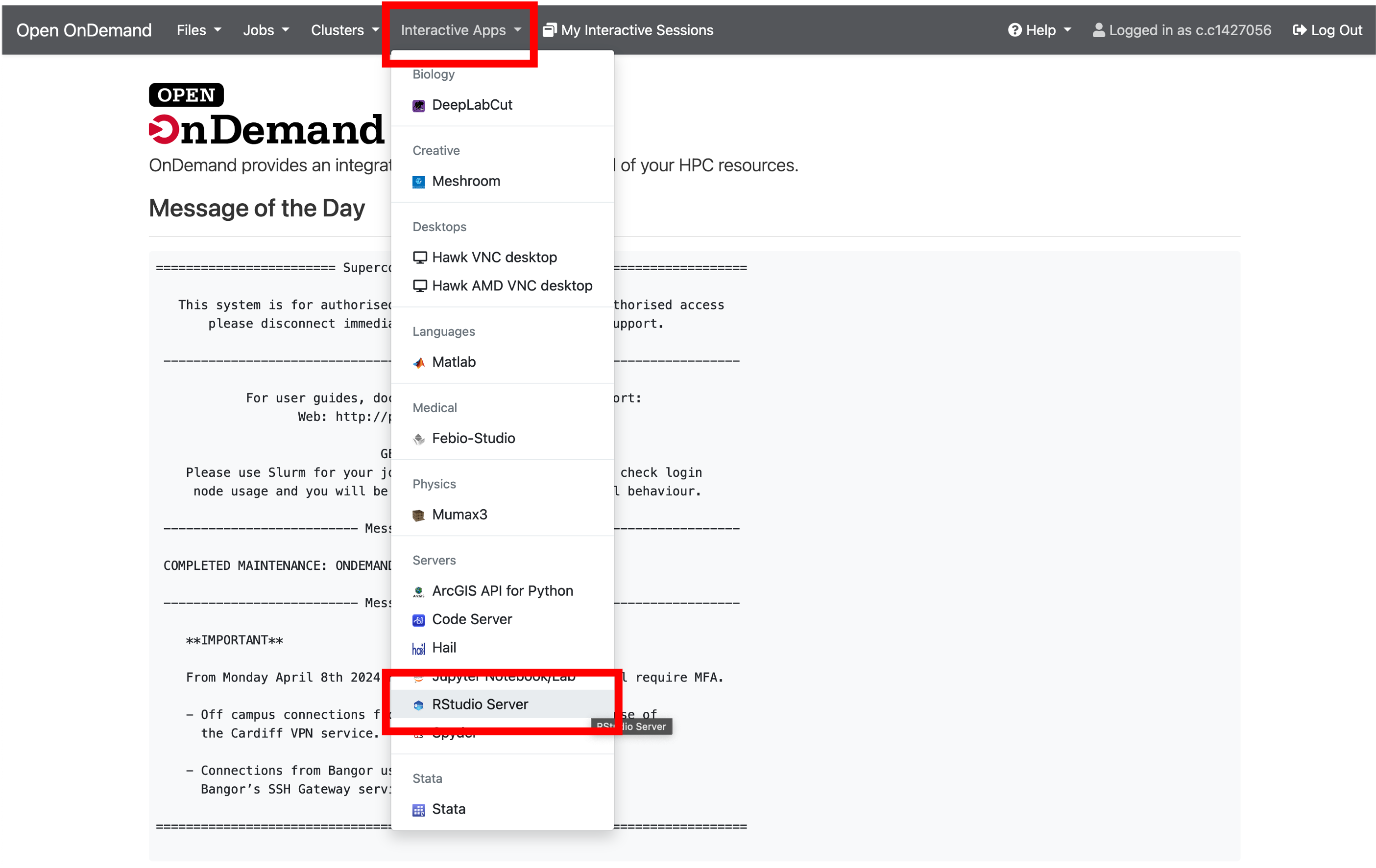
- We will use default parameters for the server, so to launch, simply scroll to the bottom of the page and click ‘Launch’.
- You will now be told that your server is in a queue and will be notified when it is active. This is usually instant, but depending on how many of us are asking to use it, could take some time to launch.
- Once it is ready to launch, you will see this window. Select ‘Connect to RStudio Server’. This will open a new tab with the server
- Now we have an RStudio server opened up which will allow us to run whatever we want without using our own computers resources. It also means that we can work directly with the files on our HAWK account without having to transfer them to our computers.
- We now want to open the shinyngs app directory and launch the app. To do this, we first need to navigate to it.
- Click on ‘File > Open File…’, this launches a popup window.
- Navigate to
nfcore-rnaseq/output/shinyngs_app/MY-STUDY-NAMEand click on `app.R and then ‘Open’.
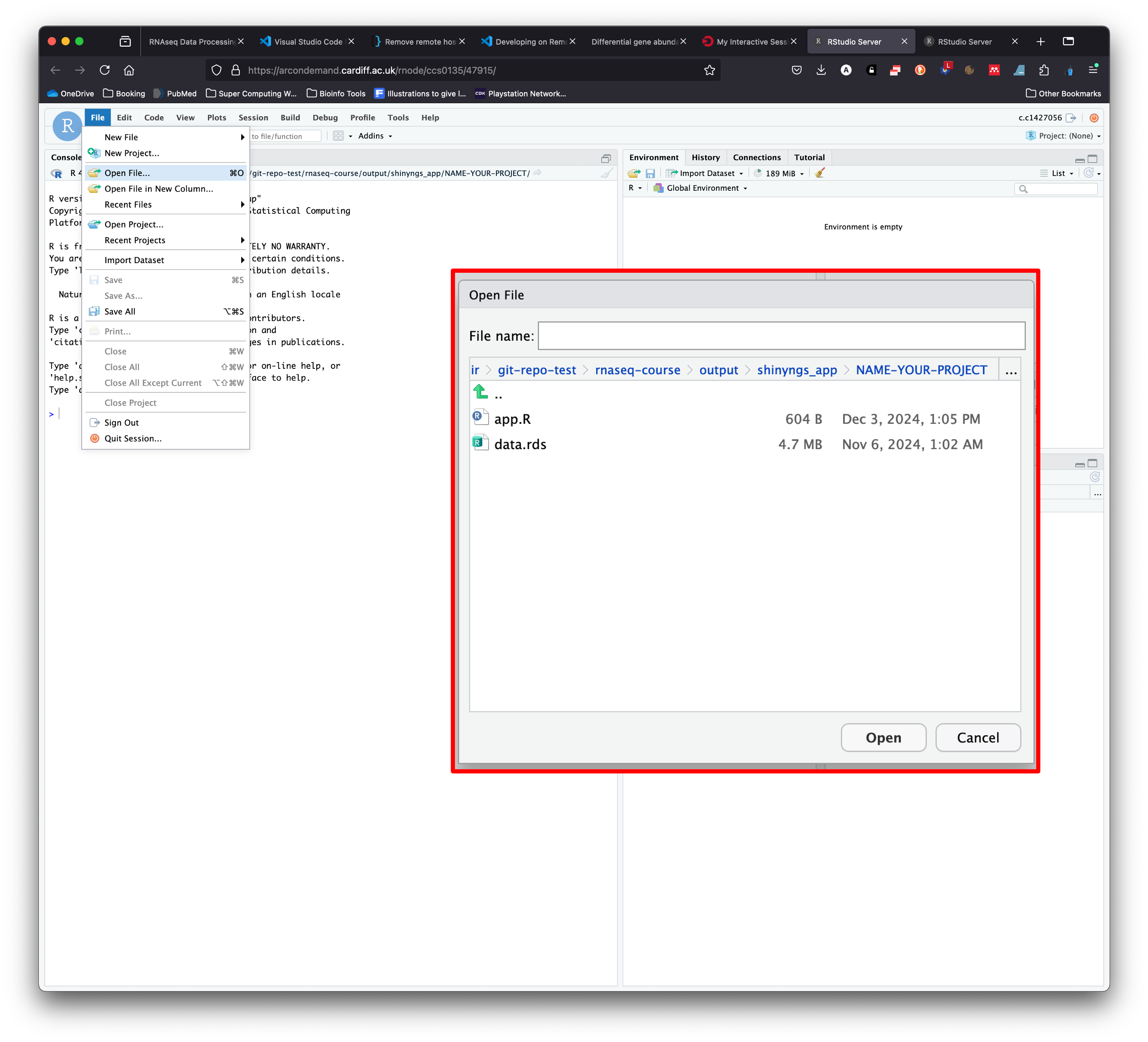
- This opens the script that is needed to launch the Shinyngs app.
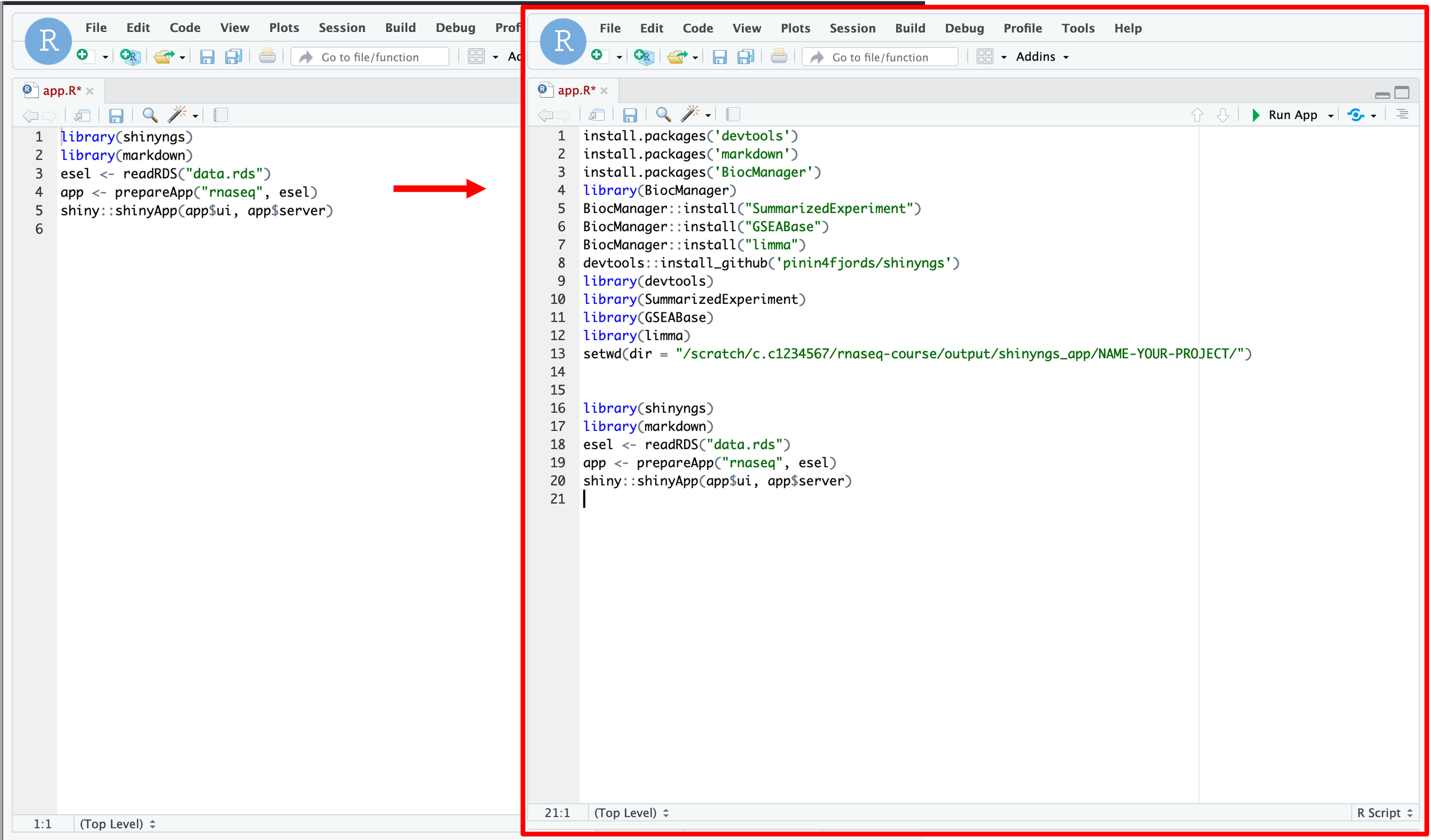
- In an ideal world, we could launch this app by simply clicking on ‘Run App’ at the top right of this script. But in reality, the script needs certain packages to be installed and loaded before we can do this.
- We can install and load these packages by editing this script.
- To do this, click on the script and hit enter a few times to move the code lower down the page.
- We can now copy and paste the code below into the top of the script.
- Note: Make sure you change the your username and project directory name:
install.packages('devtools')
install.packages('markdown')
install.packages('BiocManager')
library(BiocManager)
BiocManager::install("SummarizedExperiment")
BiocManager::install("GSEABase")
BiocManager::install("limma")
devtools::install_github('pinin4fjords/shinyngs')
library(devtools)
library(SummarizedExperiment)
library(GSEABase)
library(limma)
setwd(dir = "/scratch/c.c1234567/nfcore-rnaseq/output/shinyngs_app/NAME-YOUR-PROJECT/")
-
What we are doing here is telling R to install these pre-requisite packages. These packages are needed in order for the shinyngs package to install and work correctly.
- Now we can go ahead and run this script.
- The best way to do this is to click on the ‘Run App’ button at the top-right of the script.
- Alternatively, you can run each line by hitting
ctrl + enterorcmd + enter. - You will see that the bottom window will be populated with various text.
- Occaisionally, we will see the text ask us questions such as ‘Update all/some/none?’
- We need to answer these questions before the script keeps running.
- Answer the questions by clicking in the bottom window, typing the answer and then hitting enter:
Update all/some/none? [a/s/n]
a
- a = update all
- s = update some
-
n = update none
-
To avoid complications, we want to update all
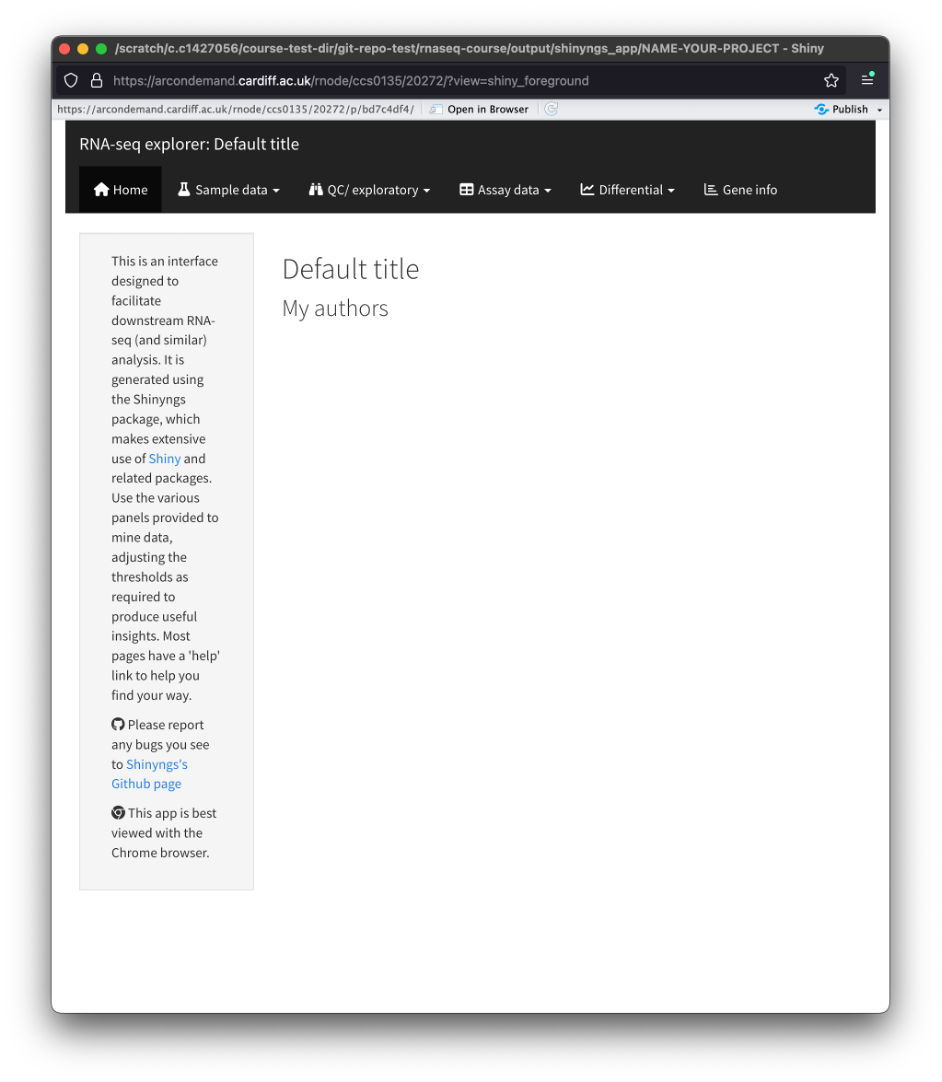
- If everything works, then you should get a pop-up window with the Shiny app.
- If this is not the case, please let me know so we can do some troubleshooting.
Home
- You will be greeted by the homepage. This page contains a small description of the app and how to navigate it.
Sample data
- Clicking on this tab opens a dropdown menu with the following options:
Experiment
- Here you will find a fancy version of the diff-abundance-samplesheet.csv that was generated prior to the pipelines execution.
- You will see the sample IDs, fastq file paths, and condition information.
Annotation
- Here you will find a table of every gene in the dataset along with the corresponding information.
QC/exploratory
- Here you will find all the analyses related to QC and exploring the dataset. This is the same as what you will find in the report web page that we covered earlier.
- You may be thinking ‘Why are we doing this if its already in the report web page?’ - because the ShinyNGS app allows us to edit the parameters, filter, and look at specific genes etc!
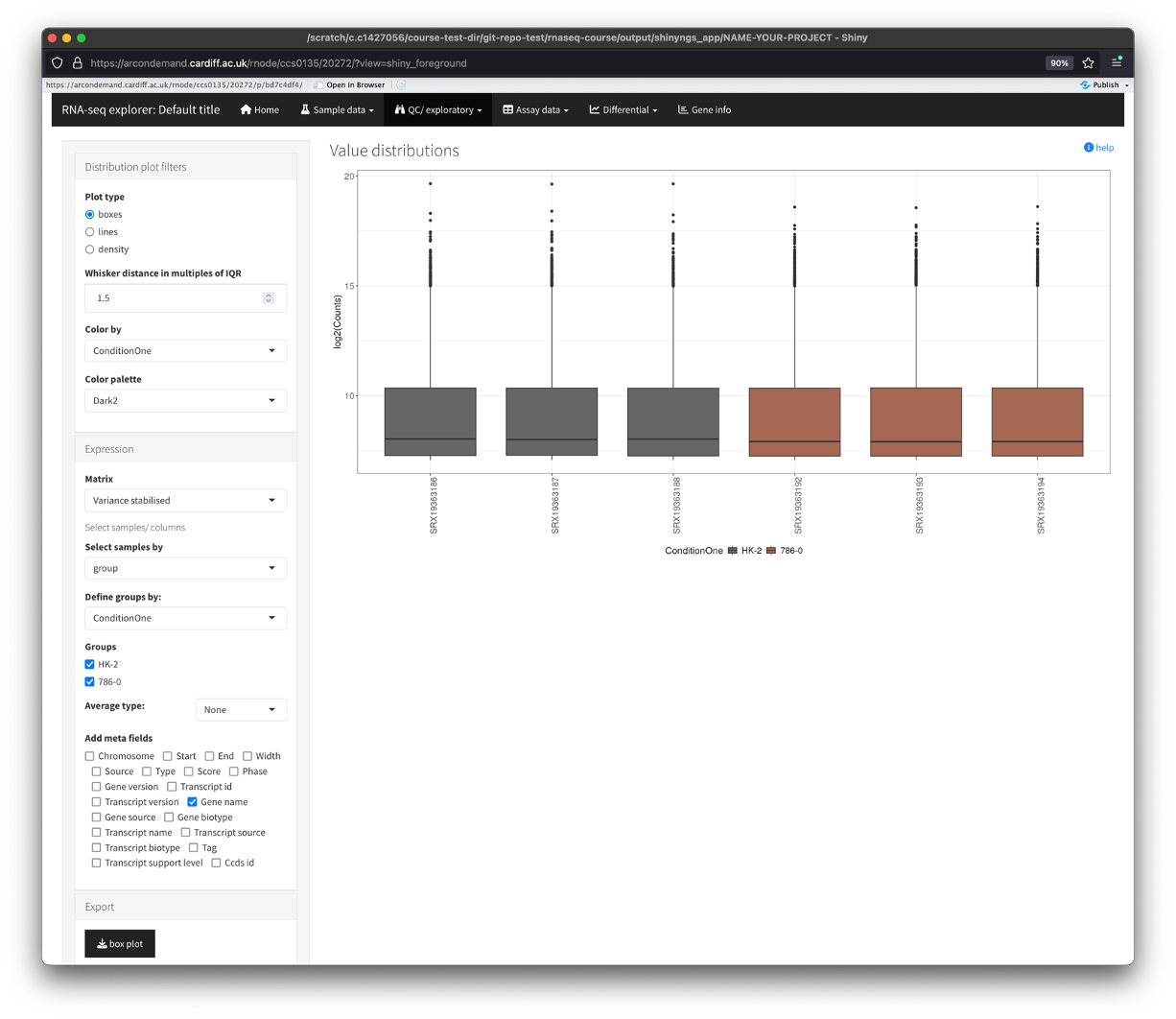
Distribution plots
- Show’s us the distribution of abundance values across the samples.
- You will see that there are parameters that we can change in the box on the left.
- You can use these parameters to change the look of the plots, colour by your conditions (if you had nore than one condition column).
- You can also change between the various data types by using the matrix dropdown box.
- Finally, you can also export the plot(s) by clicking on the button in the ‘Export’ section.
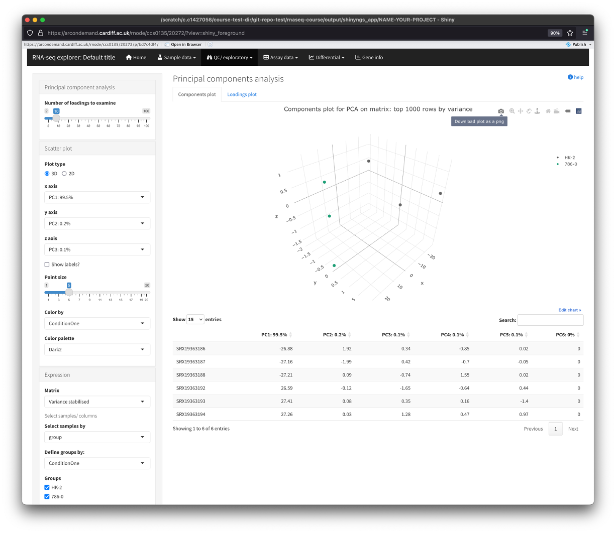
PCA
- Plots show us how the samples cluster together. We can use this to see how similar or different samples are to eachother.
- There are 2 types of PCA plot to view here, one that displays the samples, the other displays the top genes. Use the tabs along the top of the plot to view this.
- Again, there are multiple parameters we can use to edit these plots, from number of PC loadings, to point size, to how many vairable genes to perform the analysis on.
- We can also switch between 2D and 3D plots.
- To save the plot(s), hover over the plot and click on the camera icon. This will save the photo directly to your computer.
I wont cover any more of the QC/Exploratory section as it is the same as the report webpage that I covered earlier. But I hope you get the idea that this app allows you to customise these plots for your needs
Assay data
- The assay data section contains two sub-sections:
Tables
- Here you will find the data tables used for the analysis. The default view is the variance stabilised table. This contains the list of genes present in the dataset and the accompanying variance stabilised gene expression.
- Again, you can change the table by using the parameters on the left of the window.
Heatmaps
- This section displays a heatmap of the data (top 50 genes by variance).
- There are some nice options along the left, which allows us to additionally cluster the columns and select the number of top variant genes to perform the analysis on.
- The ‘Scale by’ section performs scaling of the gene expression along the chosen parameter. By default, we scale across the row. This takes the expression of each gene across all samples and scales it (usually from -1 to +1). This is to make it easier to see differences in expression of each gene across the samples.
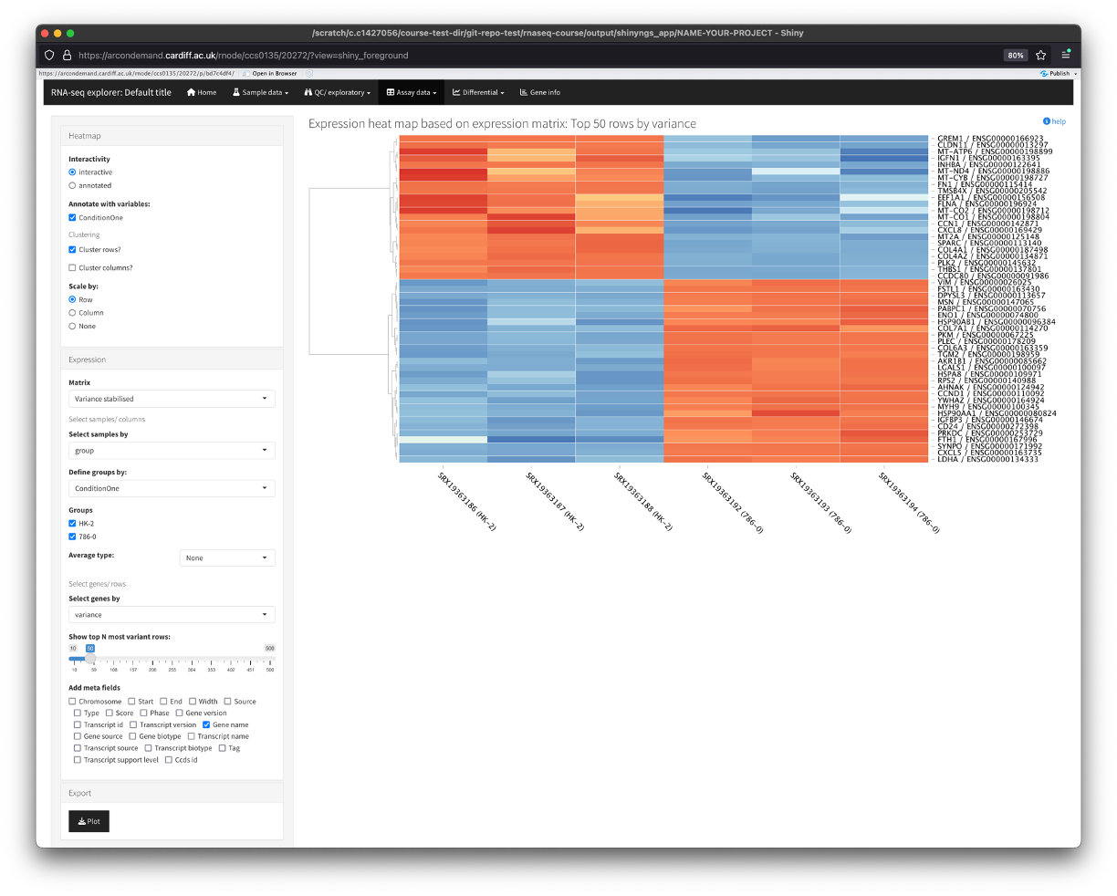
- Another nice function the app provides is the option to zoom in on certain genes/samples. To do this, use your mouse to click and drag over a specific region of the heatmap. You will see the heatmap zoom into your selection. To go back to default, simply click the heatmap.

Differential
- This is the section where we will find all the data related to the differential gene expression.
Tables
- This sub-section shows the tables containing the differentially expressed genes (DEGs).
- You will notice that the table also contains an expression value for each group, this is a ‘combined’ expression value for that particular group that was used as input for the differential expression testing.
- Along the side, we can filter this table for various parameters such as fold change expression (which is 2 by default), p value, and q value (adjusted p value).
- There is also a search box for you to search for your favourite genes.
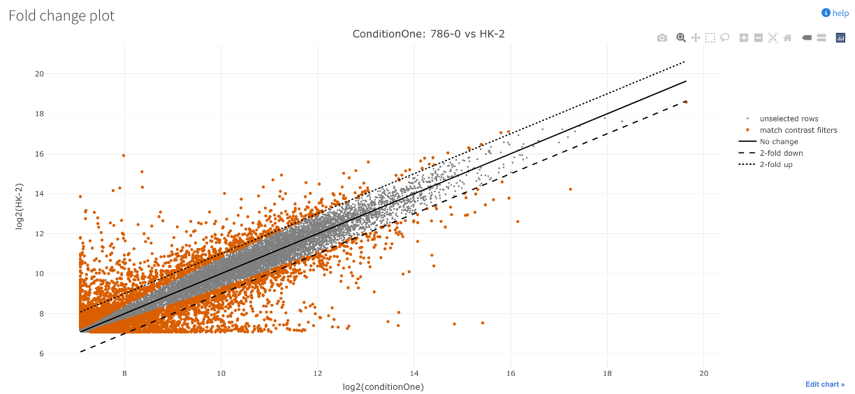
Fold change plots
- This sub-section shows a scatter plot that compares the mean gene expression value between the two sample groups.
- Again, theres various filters you can add, and you can also hover over each point on the plot to identify the gene.
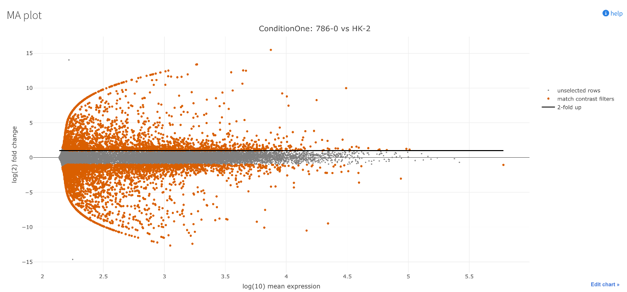
MA plot
- This sub-section shows an MA plot for the data.
- MA plots visualise the relationship between the magnitude of expression (mean expression) and the fold change across all genes.
- ‘M’ for difference: vertical axis. Shows difference in expression between the conditions (log2 fold change).
- ‘A’ for average: horizontal axis. Shows how much overall expression there is across both conditions (how ‘active’ or ‘inactive’ a gene is).
- The plot essentially tells us if genes with big changes (along the vertical axis) are generally highly expressed (towards the right on the horizontal axis) or lowly expressed (towards the left on the horizontal axis).
- A well centred/uniform plot here depicts good normalisation of the dataset.
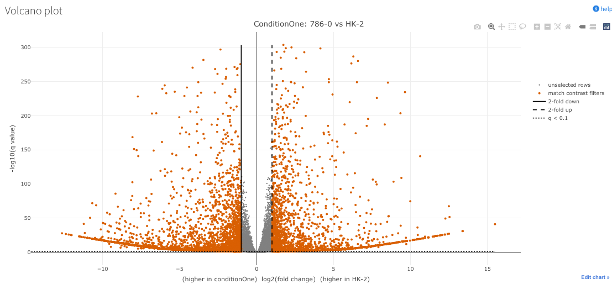
Volcano plot
- This sub-section shows a volcano plot of the DEGs.
- It shows us the degree of differential expression.
- Expression (log2 fold change) along the x-axis.
- Significance along the y-axis.
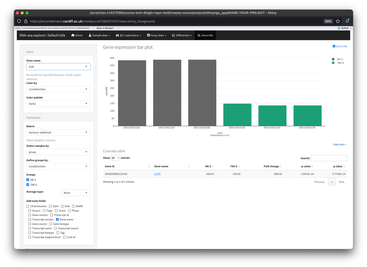
Gene info
- The last section of the app allows us to gather more information about a specific gene.
- Using the ‘Gene name’ dropdown menu on the left, you can find your gene of interest and select it.
- This will populate the main window with a bar plot of the genes expression across your dataset.
- This is a better way to visualise the expression of a gene across your dataset instead of just pulling the data from the ‘Assay data’ section.
Downstream Analyses
- This is as far as we can go with the differential abundance pipeline. Some of you may see that there is an optional Gene Set Enrichment Analysis (GSEA) plotting option on the pipe, but this is clunky at the moment.
- From here, we can take the DEGs do some extra analyses using free tools online. There is also a very good paid-for tool that the university has a licence for that I would reccommend.
File Preparation
- Before we start doing some more downstream analyses, we need to get our gene list in the correct format(s).
- When we have a list of differentially expressed genes (DEGs), we have some genes that are positively enriched (i.e. positive log2FC), and some that are negatively enriched (i.e. negative log2FC).
- This list of genes is often ordered by significance by the pipeline, rather than expression.
- What we first want to do to our DEG list is filter for significance to give us significant DEGs.
- Then we want to reorder our significant DEGs so that they go from positive-to-negative log2FC.
- This allows us to then run analyses on the ordered DEGs and also separate significantly positive and negative DEGs (if needed).
- We first need to download the tables from HAWK.
- The pipeline that we ran generated three tables for us:
merged_table.tsv,merged_table_unique.tsv, andduplicate_gene_names.tsv. merged_table.tsvcontains all of the data from the pipeline (normalised, tsv, DEG) merged into one.merged_table_unique.tsvtakes the data frommerged_table.tsvand removes duplicated genes.duplicate_gene_names.tsvcontains the duplicated genes frommerged_table.tsv.- Explanation: the pipeline does its magic on unique ensemble gene IDs, which you will see that there are no duplicate ensemble IDs in the
merged_table.tsv. However, when we convert gene ID to gene symbol, there are often multiple gene IDs that map to the same gene. These genes tend to be pseudogenes or ribosomal genes (ones that we are not (usually) interested in). For our downstream analyses, we want to ensure that we dont have any duplicated gene symbols in the data, so we simply remove them and store them in another table. - To do download the tables, right click on the file in VSCode and click ‘Download’. Then specify where you want to save the file on your PC.
- Now we can open this file in Excel. To do this, right-click and click `Open With’ then choose Excel.
-Note: We now need to use this table to make a few new tables which we will use as input for various tools. I would strongly reccomend firstly duplicating the table and editing the duplicated table.
Significant DEGs
- After duplicating the
merged_table_unique.tsv, rename it to whatever you want. I would reccommend being as descriptive as you can in your file naming. - Example:
786-0_vs_HK-2_sigDEGs.tsv - Example:
786-0_vs_HK-2_sigDEGs_padj0.05.tsv - Now open the file in Excel.
- The table is currently showing us normalised, tsv, and DEG data.

- We now need to delete columns. Delete columns C-P. This leaves us with the DEG only data.
- We can also then delete the top row (row 1) to get rid of the
data_typeinformation. - Lastly, we can now delete columns C, E, and F to get rid of the
baseMean,lfcSE, andpvaluecolumns. - We should be left with 4 columns:
gene_id,gene_name,log2FoldChange, andpadj.
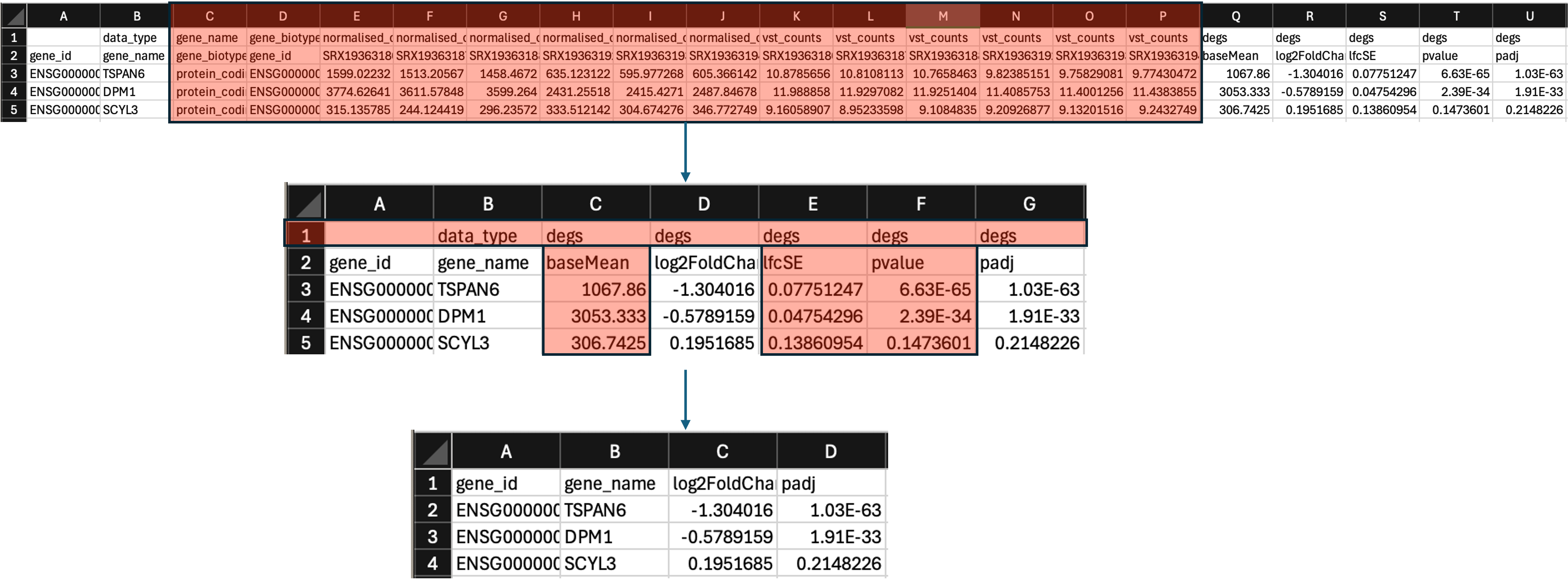
- Now we can filter this table for significance. To do this, I would strongly reccomend the following:
- Click on column D to highlight it.
- Now click ‘Sort & Filter’ and select ‘Sort Smallest to Largest’. Choose the ‘Expand the selection’ in the next popup window.
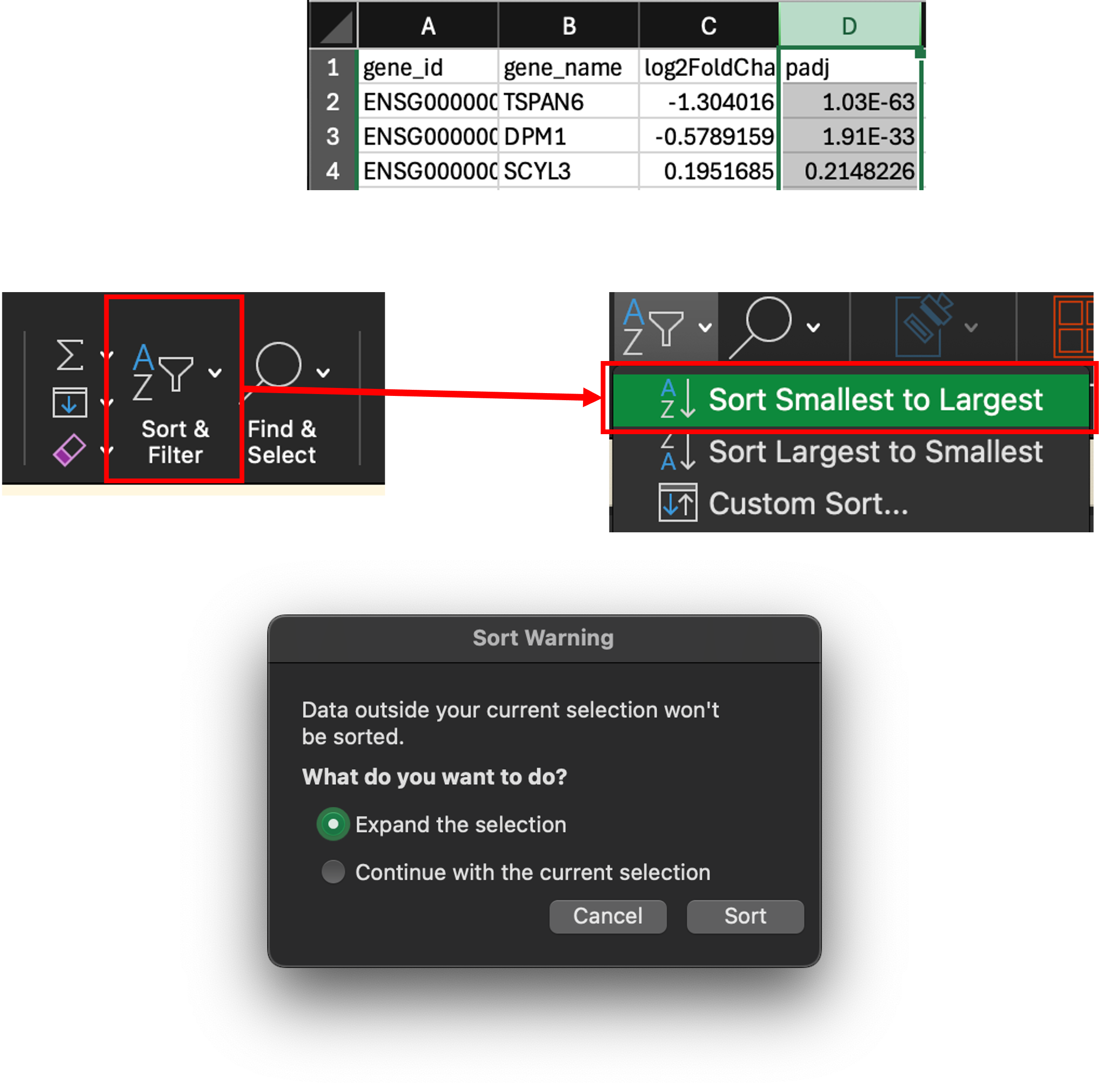
- We have now sorted the table by lowest to highest p adjusted value. We can now scroll through this table and delete the non-significant rows.
- The reason I reccomend doing it this way is that sometimes these tables can be thousands and thousands of rows long. Using the filter function sometimes doesn’t work as it should and often slows down your PC whilst filtering.
- Scroll through the table to find padj < 0.05. For me, this is on row 13,158.
- Click on cell A13158, then scroll to the end of the table.
- Now hold
shiftand click on the last cell in column D to highlight the non-significant cells. - Right click on the selected cells and click ‘Delete…’. In the popup window, click ‘Shift cells up’.
- We are now left with our significant DEGs. Save and then close the table.
Significant UP and DOWN DEGs
- Most of you will only be interested in analysing the significantly upregulated genes in your dataset.
- It is completely up to you how you go about this, but I always find it easier to have one file for each, i.e. all DEGs = 786-0_vs_HK-2_sigDEGs.tsv. UP DEGs = 786-0_vs_HK-2_sigDEGs_UP.tsv. DOWN DEGs = 786-0_vs_HK-2_sigDEGs_DOWN.tsv.
- However, I understand that most of you will want to keep things as simple as possible and not want to get bogged down by lost of files.
- I would strongly reccommend splitting your DEG file into UP and DOWN DEGs, either by creating additional files, or by creating a new sheet for each in the 786-0_vs_HK-2_sigDEGs.tsv file.
Preranked DEGs for GSEA
- For Gene Set Enrichment Analysis, we will need to take these significant DEGs and rank them by log2 Fold Change.
- To do this, lets duplicate the significant DEG file and name it
preranked-DEGs-GSEA.tsv. - Open the table and delete columns B and D to remove the
gene_nameandpadjcolumns. - We are now left with 2 columns:
gene_idandlog2FoldChange. - We now need to delete the top row of the table, i.e. delete the headers. We need to do this so that GSEA software can correctly read the file.
- Lastly, we need to order the
log2FoldChangecolumn (column B) from highest to lowest. To do this higlight the whole of column B by clicking on it, then click on ‘Sort & Filter’ and select ‘Sort Largest to Smallest’. In the popup window, click ‘Expand the selection’.
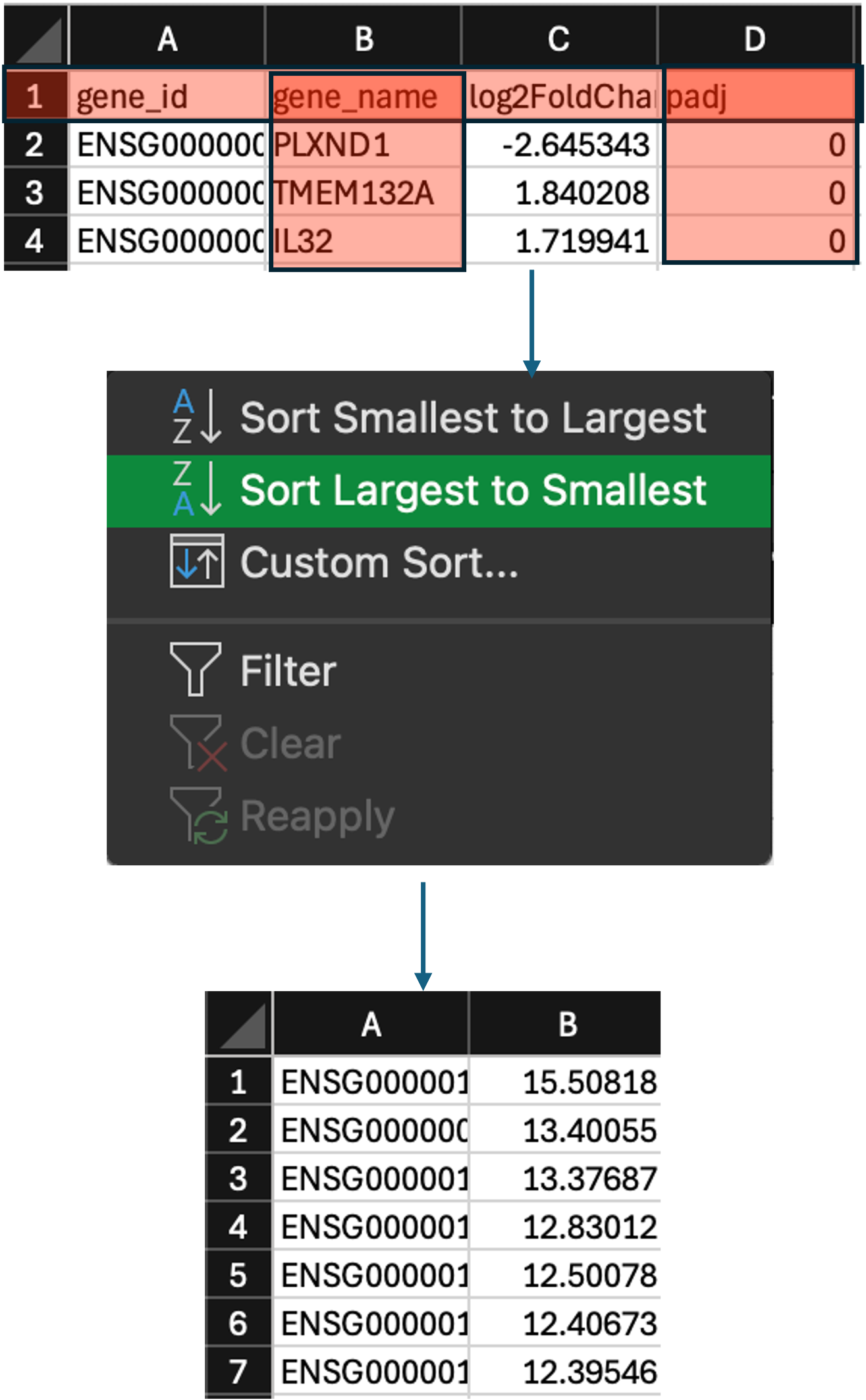
- We have now preranked our DEGs. The last thing we now need to do is make sure we save it in the correct format, and rename it so that the software can recognise it.
- We first need to save the file. Click on ‘File’ then select ‘Save As…’.
- Select the location to save the file, and then use the ‘File Format:’ dropdown bowx to select
Tab-delimited Text (.txt). - You may have a popup window asking ‘do you want to keep using this format?’, select ‘Yes’.
- We have now saved our file as a tab-delimited text (.txt) file (
preranked-DEGs-GSEA.txt).
What is a tab-delimited text (.txt) file?
- A .txt file is simple text file that stores tabular data such as text and numbers in a specific structured format. - Each line of the file corresponds to one row in the table. - Within each line, fields(columns) are separated by tab. - For example, the .txt for the table below looks like:
| Column-1 | Column-2 | Column-3 |
|---|---|---|
| input1 | input2 | input3 |
| input4 | input5 | input6 |
| input7 | input8 | input9 |
Column-1  Column-2  Column-3
input1  input2 input3
input4  input5 input6
input7  input8 input9
- However, the GSEA software does not recognize the .txt file as a preranked gene list. We instead need to make the file a ranked file (.rnk)
- We have already formatted the table to conform to the requirements of a .rnk file, we just now need to simply change the file extension from .txt to .rnk.
- There are multiple ways to do this. One of the ways is to use the ‘rename’ option when right clicking on the file. However, in some cases (especially on Mac), users do not have the file extension visible (I believe this is by default), and so renaming the file
preranked-DEGs-GSEA.rnkwill actually make itpreranked-DEGs-GSEA.rnk.txt. - Instead, we will use the terminal window in VSCode to use the
cpcommand. - Open VSCode again, and click on
Filethen selectOpen Folder. Then select the folder where you saved the files. - Now click
Terminaland selectNew Terminalto open a new terminal window at the bottom of your screen. The terminal should be in the correct directory. Check using thepwdcommand. If you are not in the correct directory, use thecdcommand to get there. - Now we can use the
cpcommand to copy thepreranked-DEGs-GSEA.txtfile to the same location but under a different extension:
# check to see if you're in the correct location
pwd

# check to see if the file is there
ls *.txt

# copy the file and change the extension
cp preranked-DEGs-GSEA.txt preranked-DEGs-GSEA.rnk
Text here
Gene Set Enrichment Analysis (GSEA)
- GSEA is a popular tool used to see what processes/gene sets that our DEGs are enriched in.
- We should all have this application installed - if not, please let us know so we can get you sorted ASAP.
- Lets double-click on the app to open it.
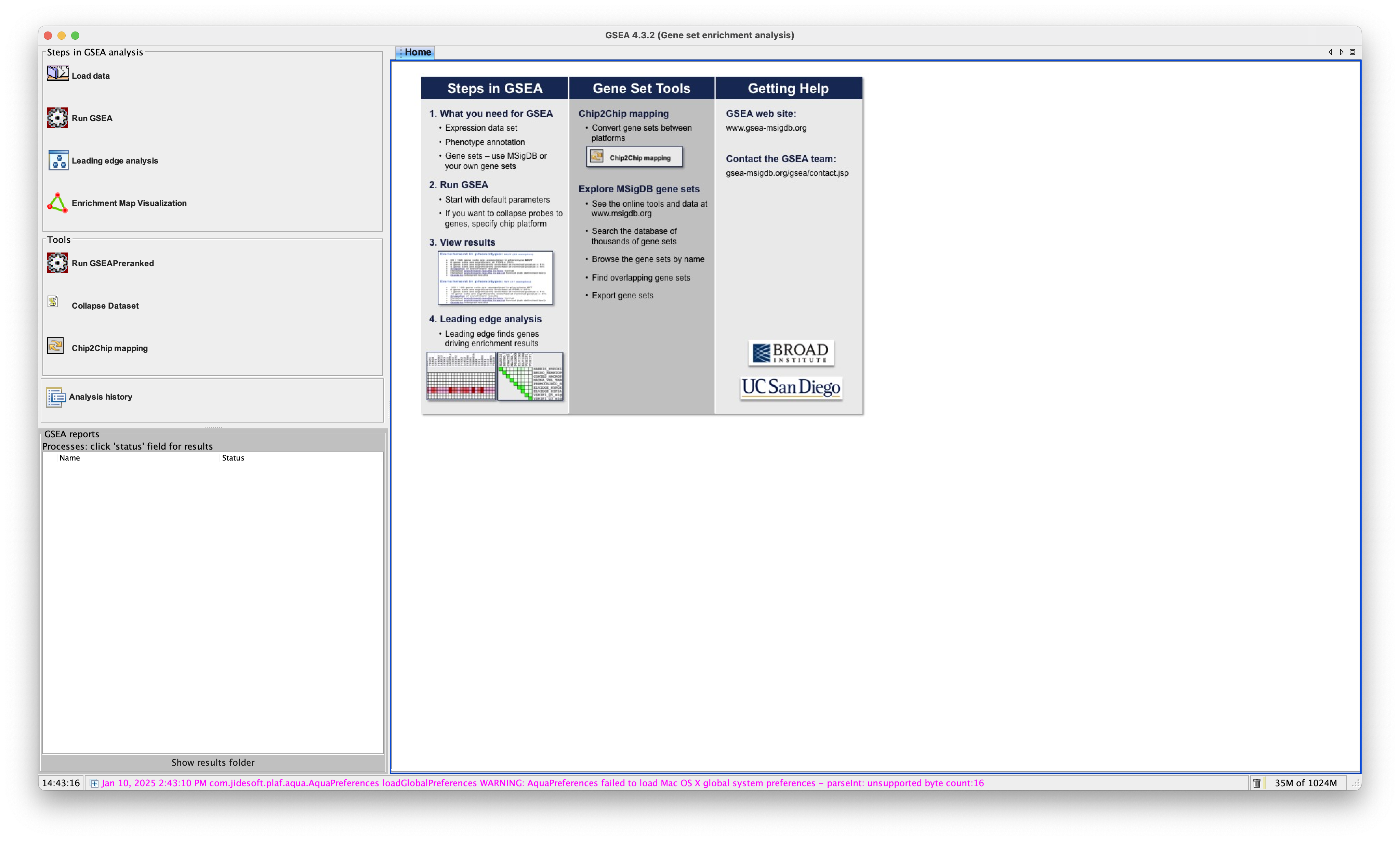
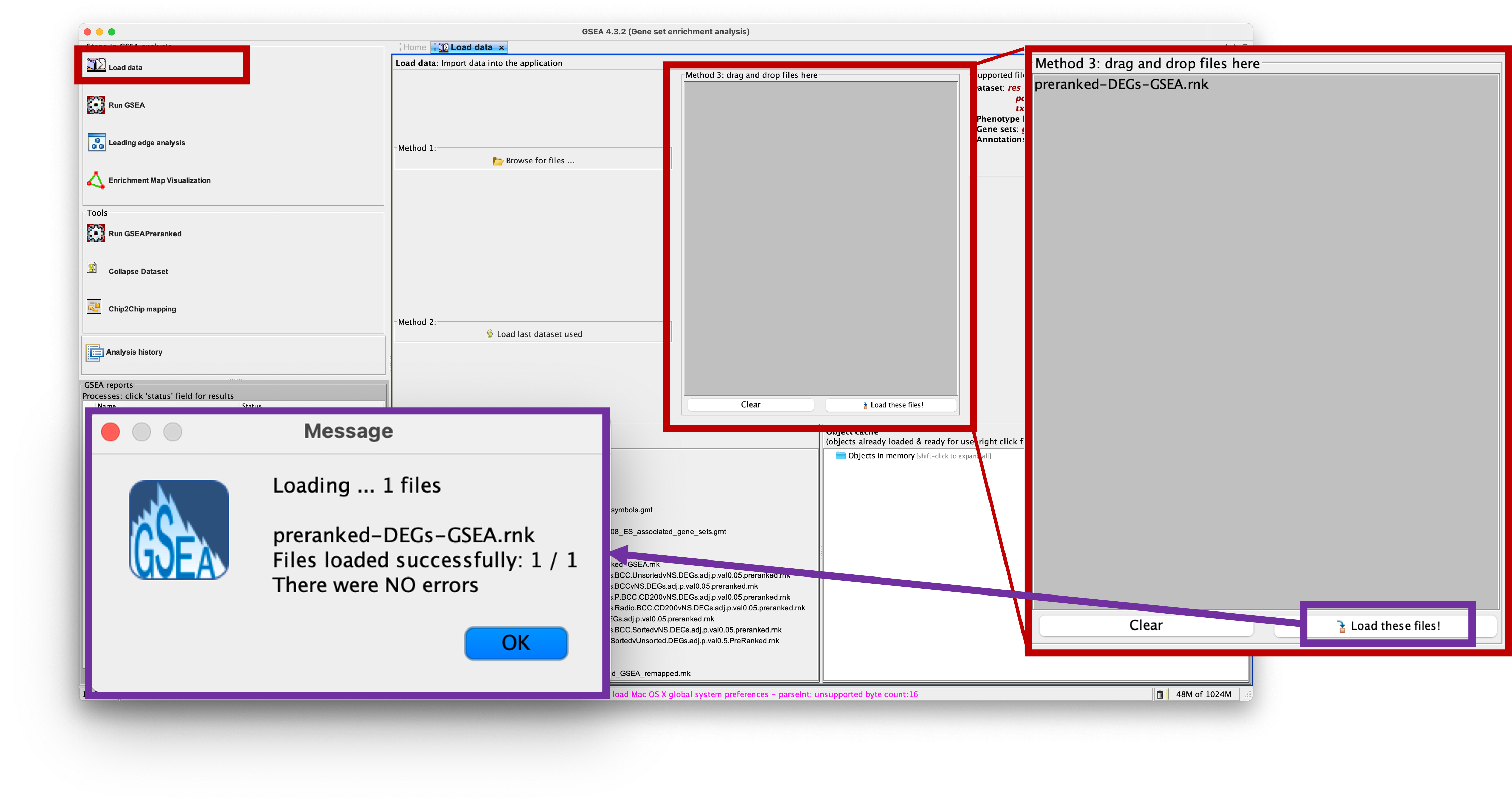
- We firstly need to load our data into the app. To do this, click on the ‘Load Data’ option on the left of the app.
- Then we can either use Method 1 which launches a browser to find your file, or Method 3 which we can simply drag and drop our file into the grey box.
- I will use Method 3 to drag and drop the
preranked-DEGs-GSEA.rnkinto the box. The file should then appear in the box. - Now I can load the file into the app by clickin on ‘Load these files!’ at the bottom of the box.
- You will see a small popup window that notifies you that the file was loaded with no errors. If you have anything else, please let us know.
- Now we can get to the fun part.
- As we have preranked our DEG list, we need to use the appropriate analysis tool - GSEAPreranked.
- Click on the ‘Run GSEAPreranked’ option on the left of the app in the ‘Tools’ section.
- A new window will load in the main section of the app.
- We now need to edit each parameter here to run the analysis.
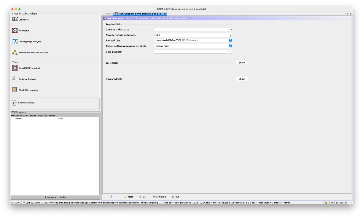
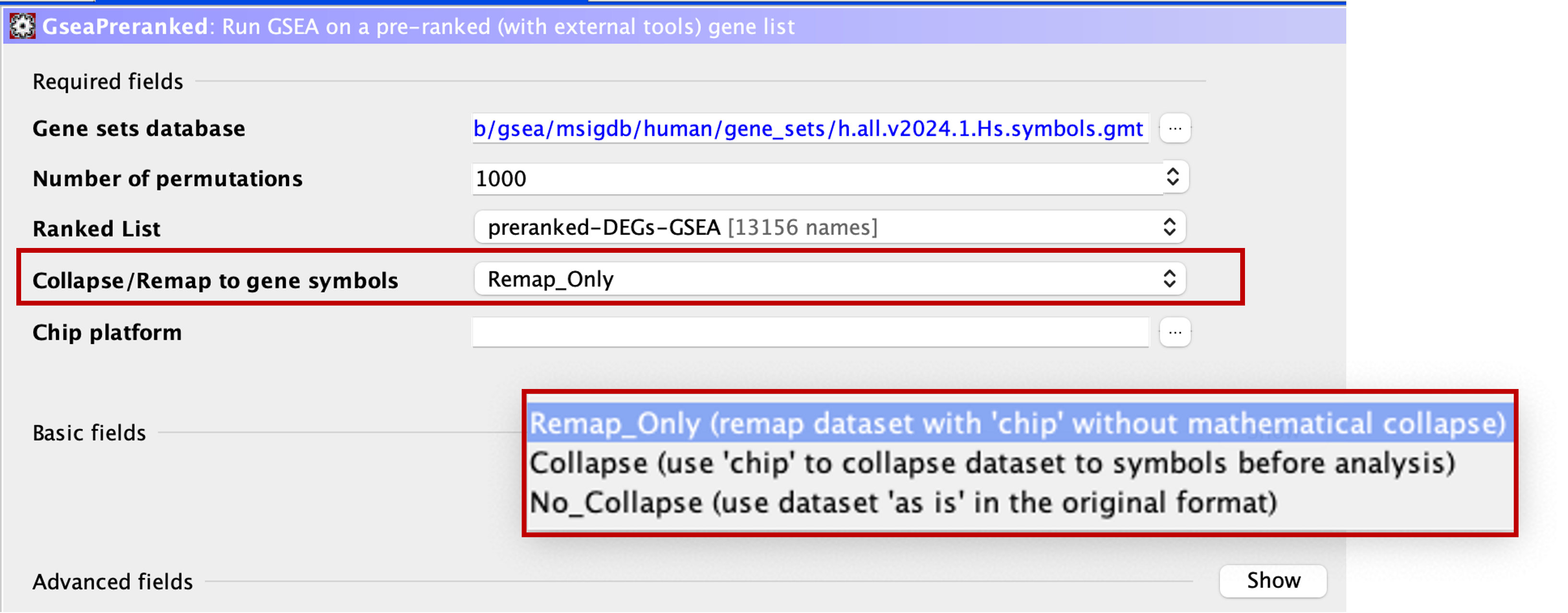
Gene Sets Database
- This section allows us to choose which gene sets database we would like to perform the analysis on.
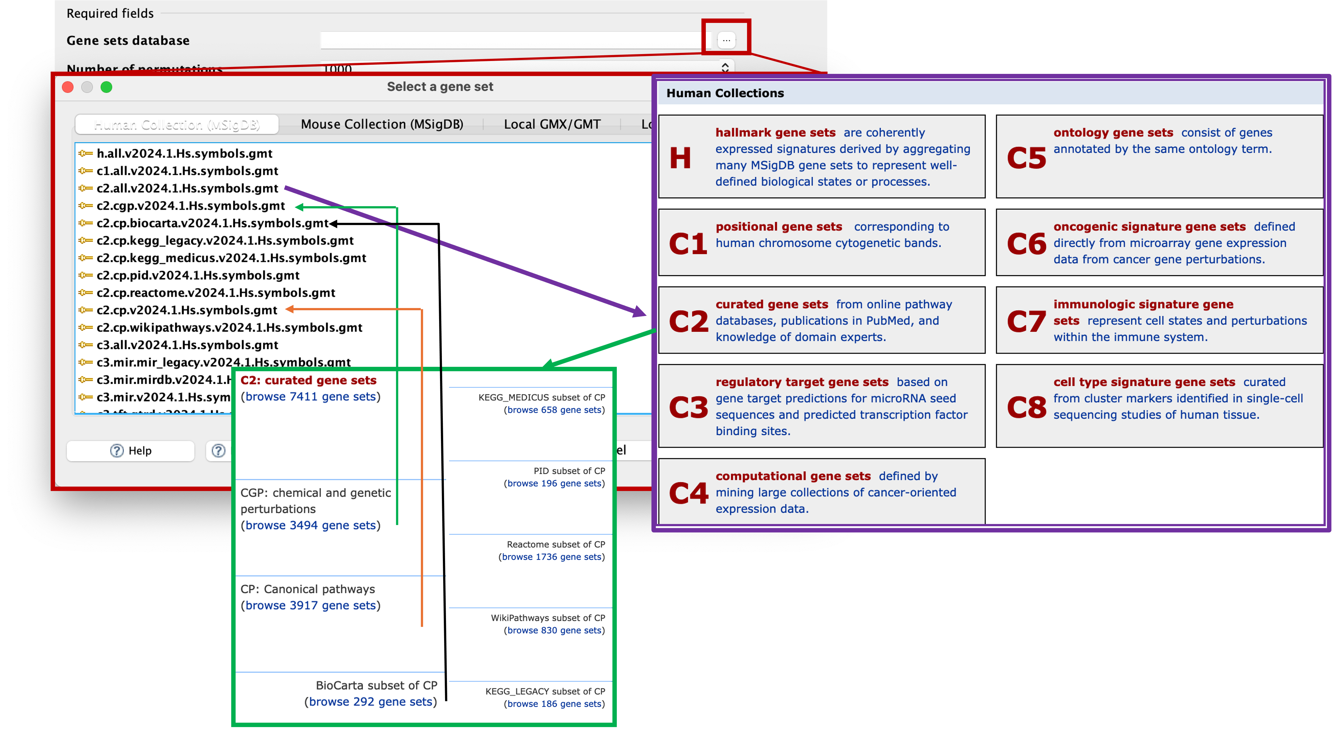
- Click on the three dots (…) next to the selection box to launch the ‘Select a gene set’ window.
- From here, we can choose between human or mouse collections along the top tabs (or if we had our own gene sets, we could select local).
- As we are using a human dataset, we will stay on the tab we are currently in.
- You can see that there is a massive list of gene sets to select from. Don’t be scared of this list, it may look like a load of letters and numbers, but it will all make sense.
- These selections reflect the gene sets located on the Molecular Signatures Database (https://www.gsea-msigdb.org/gsea/msigdb/index.jsp).
- As you can see, H stands for Hallmark gene sets, and we have a range of gene sets representing C1 - C8.
- The gene sets are labelled as
CollectionID.SubsetType.DatabaseName.Version.Organism.GeneType.gmt. - So if we look at the top selection:
h.all.v2024.1.Hs.symbols.gmt-hmeans its from the Hallmark gene sets.allmeans that its all of the hallmark gene sets. It’s the 2024 version with Human gene symbols. - If we look at:
c2.all.v2024.1.Hs.symbols.gmt- This means that its from the C2 section which is the curated gene sets andallmeans its all of the curated gene sets. - If we look at:
c2.cgp.v2024.1.Hs.symbols.gmt- This means that its from the C2 - curated gene sets section, andcgpmeans that its the chemical and genetic perturbations. - If we look at:
c2.cp.v2024.1.Hs.symbols.gmt- This means that its from the C2 - curated gene sets section, andcpmeans that its the canonical pathways. - If we look at:
c2.cp.biocarta.v2024.1.Hs.symbols.gmt- This means that its from the C2 - curated gene sets section, andcpmeans that its the canonical pathways.biocartameans its the biocarta database subset of the canonical pathways section. - We should now understand how these are named and know which ones we want to choose for our analyes.
- You may be thinking ‘If theres the ‘all’ version there, whats the point of running subsets when I can just run everything?’ - The answer is compute power and if your PC is tough enough to handle the data.
- The way the application works is by downloading the gene set(s) that you have chosen to analyse against and load it into the application. Then it does its thing and gives you your results.
- Some of these gene sets are small, such as the Hallmarks database which is 50 gene sets. This doesnt take up a lot of space or memory to download and analyse, whereas others, such as C2 all, are > 7000.
- This can take a while to firstly download the gene sets, and then also take some time to actually run the analysis.
- Additionally, running the
alloption can also make it difficult to find certain database results in the final results, so running individual database analyses may be better for you. - To keep things running smoothly, we will select the smallest database,
h.all.v2024.1.Hs.symbols.gmt. Double click, or click to highlight and then select ‘OK’.
Number of permutations
- This is where we can specify the number of gene set permutations to perform in assessing the statistical significance of the enrichment score. The developers reccomend using 1000 (default) here.
Ranked List
- This is where you tell the application which ranked list of genes you would like to analyse.
- This section should already be populated. However, if you have uploaded multiple preranked lists, you will need to use the dropdown menu to select the appropriate one.
Collapse/Remap to gene symbols
- This section allows us to select how the app treats our ranked gene list.
- The genes in our ranked list are Ensemble IDs, i.e. ENSG0000000012345. This is also referred to as gene ids. Gene names, i.e. GENE1, are referred to as gene symbols.
- Every gene set in the Molecular Signatures Database exists as gene symbols.
- This means that if we were to run the analysis as it is, the app would be trying to analyse our genes, which are gene ids, against a list of gene symbols. As you can imagine, this wouldn’t work.
- We first need to ensure that our gene list is in the same format as the genes in the gene sets.
- If we click the dropdown menu here, you will see that there are 3 options.
- We need to select the
Remap_Onlyoption, which takes the information from the chip that we will provide in the next step to convert the gene ids to gene symbols. i.e. it will change ENSG00000012345 to GENE1.
Remap_Only, Collapse, or No_Collapse?
Collapse - GSEA was originally run on microarray data (such as Affymetrix), in which you would have multiple probes mapping to the same gene. The Collapse option was then used to collapse multiple probes into one reading for the gene. - This method uses mathematical models to collapse the probe information. Remap_Only - This option is similar to the Collapse option, but instead of condensing multiple probes into a single gene symbol, it just converts the gene ID into gene symbol. - It does not perform mathematical calculations. No_Collapse - This tells the app to use the provided list 'as is' and not perform and collapsing or remapping.
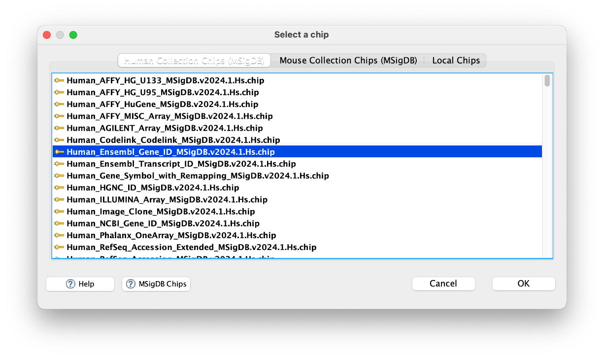
Chip platform
- This is where we tell the app what platform to use for the ‘Collapse/Remap to gene symbols’ function.
- As we have Ensemble IDs in our ranked dataset, we need to tell the app this.
- Click on the three dots (…) next to the box and select
Human_Ensembl_Gene_ID_MSigDB.v2024.1.Hs.chip.
Basic Fields
- There are additional sections that we can edit before we perform the analysis. I would reccommend changing a few in the ‘Basic Fields’ section.
- Click the ‘Show’ button to expand this section.
Analysis name
- This is one of the important ones we should change.
- GSEA app makes a new directory for every analysis it performs. To save you a LOT of time, this option should be changed every time.
- As we will be running the Hallmarks gene set, lets name this analysis
hallmarks.
Erichment Statistic
- Here you can select how the running-sum statistic is calculated. I won’t go into detail how this works, but we will stick with the default parameter here.
Max/Min size
- These two parameters are filters that the app uses to select gene sets for the analysis.
- If a gene set (from Hallmarks database, for instance), is above, or below the filter, that gene set is omitted from the analysis.
- Small gene sets can lead to statistically unstable results as the enrichment scores can be driven by just a few genes which may not be representative.
- Large gene sets may lack specificity and can dominate the enrichment results, making it harder to detect meaningful patterns.
- I always stick to default here. But it is completely up to you what you use as your filters.
Save results in this folder
- Lastly, we should also change this section to save the outputs in a specific location.
- I always reccomend creating a directory somewhere (usually in your results directory) named GSEA, and using this filepath.
- To specify a location, click on the three dots (…)
Advanced Fields
- I never change any parameters here, so I won’t cover anything for this section.
GSEAPreranked Information Page
- If you want to find out more, click this Link to GSEAPreranked Page.
Running GSEA
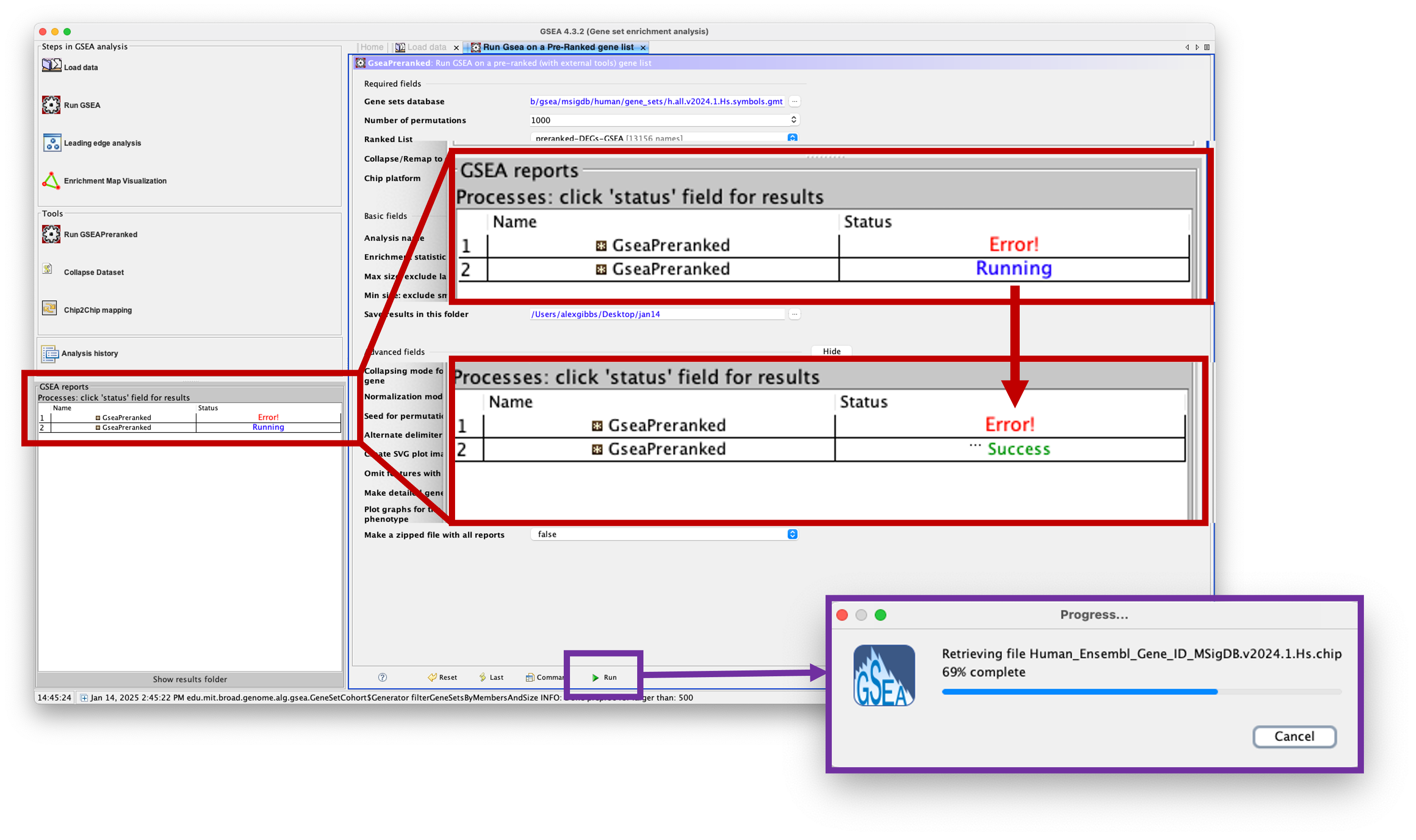
- Now we have uploaded our data and added our parameters, we are ready to run the analysis.
- To do this, simply click the
Runbutton at the bottom of the screen. - A small window will pop up notifying you that it is downloading the gene sets. It will then close after it has finished doing so.
- To view the progress of the analysis (handy for larger gene sets and bigger datasets), check the
GSEA reportswindow at the bottom left of the window. - You will see that your analysis is ‘Running’. If anything goes wrong, you will see ‘Error!’. If it has completed, you will see ‘Success’.
Viewing the results
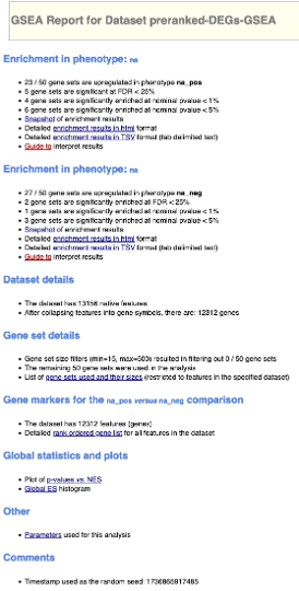
- To view the results, simply click on ‘Success’ in the ‘GSEA reports’ window. This will load a webpage.
- There are 2 main sections of this results page, those of na_pos and those of na_neg.
- In order for us to understand what these are, lets take a look at one of some example enplots:
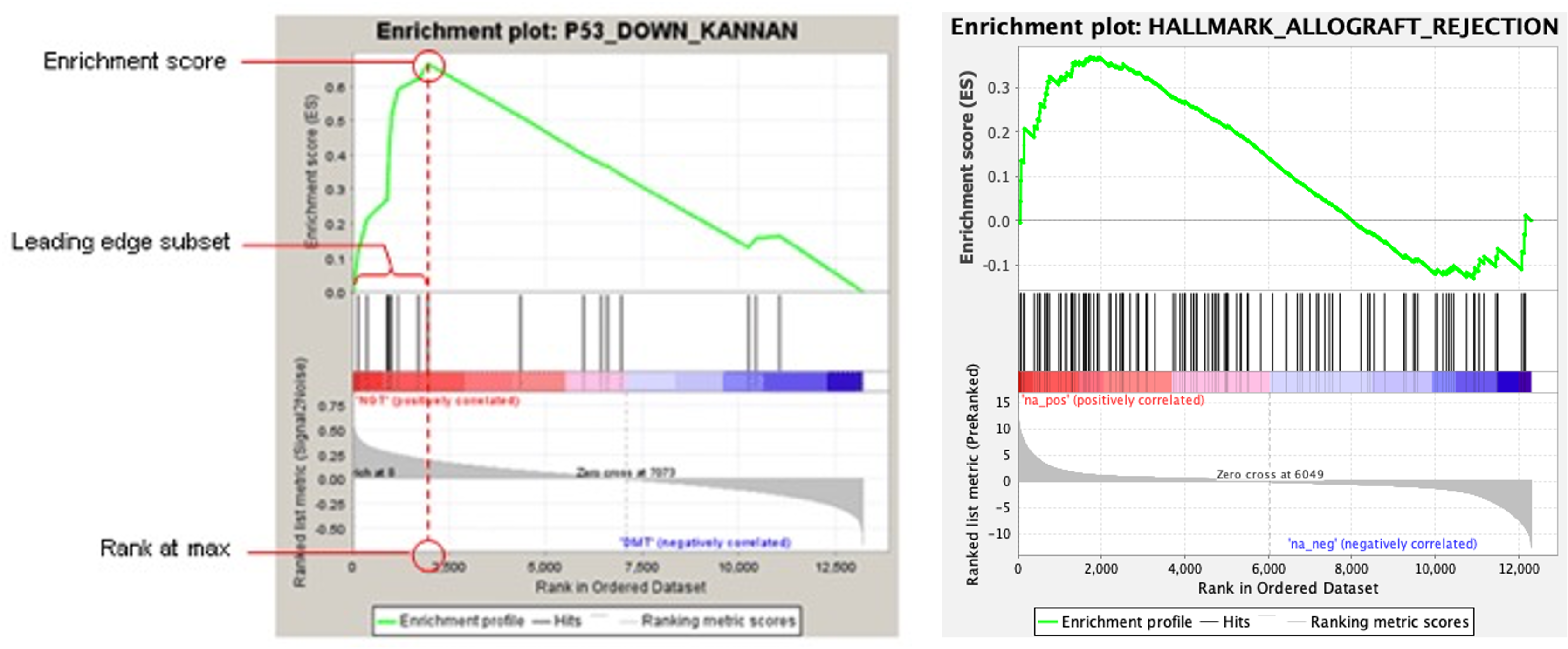
- The enrichment, or enplot, is split into 3 sections horizontally.
- Lets focus on the bottom section first. This section shows our preranked DEG list on its side. Instead of the list going from top-to-bottom, it is going from left-to-right. This means that our most expressed DEGs are on the left, and least expressed DEGs are on the right. In other words, we have positive log2FC on the left, and negative log2FC on the right.
- Depending on where the switch from positive- to negative-log2FC is, this is where the software adds the label ‘Zero cross’. It also tells us where the zero cross is, in this example, at row 6049, the DEGs turn from positive-to-negative.
- You will also see that the software has added ‘na_pos (positively correlated)’ and ‘na_neg (negatively correlated)’ to this section. This means that the DEGs in this particular section are positively- or negatively-correlated for the particular gene set we are analysing (if they are present in the gene set, that is).
- When we run the analysis, the software starts at the top of the preranked DEG list (or as we look at this plot, the left), and walks down the list until it reaches the bottom. Each time we get a ‘hit’, i.e. a DEG in our list that is present in the gene set, it is scored. The more hits, the greater this score gets.
- As we go down our list (from left-to-right) the value of this ranking metric decreases, meaning that genes at the top of our list will score higher if they are present in the gene set. The ranking metric as we go down the list is indicated by the grey bars in the bottom of the plot.
- This score is known as the enrichment score (ES). As we walk down our DEG list, if there are no ‘hits’, then the ES slowly decreases, and further ‘hits’ will then add to the score. The ‘overall’ ES score is where the ES is maximally deviated from zero.
- If we look at the top of the plot, we can see a graphical representation of the ES via the green line. We can see that this ES shoots up towards the top of our DEG list, and then slowly decreases as we go down it.
- When we assess whether we get positive- or negative-enrichment, we look at the ES. This score is what we should use if we are looking at a single gene set.
- However, as we are looking at all the gene sets that are a part of the Hallmarks database, we should use the normalised enrichment score (NES).
- The NES adjusts the ES by normalising it to account for differences in the size and variations of gene sets.
- The middle section of the plot shows the gene ‘hits’ as vertical bars.
-
Lastly, the software also identifies the ‘leading edge’ of the DEG list. The leading edge is the subset of DEGs that contribute most to the ES. For a gene set that is positively enriched, the leading edge is seen at the top of our DEG list, and is the DEGs that are present before the peak ES.
- Now going back to the webpage results that we have opened. The ‘na_pos’ section is referring to our posititely-regulated genes, i.e. our positive log2FC DEGs. Likewise, the ‘na_neg’ refers to our negatively-regulated genes.
- If we look at the results for the ‘na_pos’ section, the software has determined that 23/50 of the gene sets in the Hallmarks database are enriched in our positive log2FC DEGs. I.e. our DEGs are positively enriched for 23/50 Hallmark gene sets.
- 5 of these gene sets are significant with a false discovery rate (FDR) < 25%. The FDR is the estimated probability that a gene set with a given NES represents a faslse positive finding. This means that 3/4 times, the results are valid.
- 4 of the gene sets are significantly enriched at a nominal p value < 1%, and 6 at < 5%. The nominal p value estimates the statistical significance of the enrichment score for a single gene set. Note: This p value is not corrected for gene set sizes and multiple hypothesis testing, so don’t use this for comparing between gene sets.
- The snapshot of enrichment results is a clickable link which loads a new webpage containing the top 20 enriched gene sets. You can also get these results as a webpage table, or a downloadable table.
-
Additionally, there is a link which explains how to interpret all the data.
- We can also view these results in the folder that we told the software to save to. Opening this folder will show you a million and one things. Don’t freak out.
- The files we want to look at are the .png files (should be at the top of the folder) named
enplot_HALLMARK_GENE.SET.NAME.png. These are the enplots. - To get the information into tabular format, look for the
gsea_report_for_na_pos_1234567.tsvorgsea_report_for_na_neg_1234567.tsv. These are also available in .html format. - Additionally, if you want more information on a specific gene set result - look for
HALLMARK_GENE.SET.NAME.html. This will load a webpage with the enplot and information on each gene that is present in that gene set.
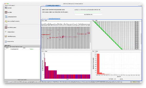
Running Leading Edge Analysis on the GSEAPreranked results
- We can also run an extra analysis on the GSEA app - Leading Edge Analysis.
- This takes the DEGs at the leading edge of our dataset for each analysis, and analyses them.
- This analysis is useful to see which DEGs in your dataset are bigger players in the gene sets.
- To run the analysis, click on ‘Leading edge analysis’ on the left side of the GSEA app window.
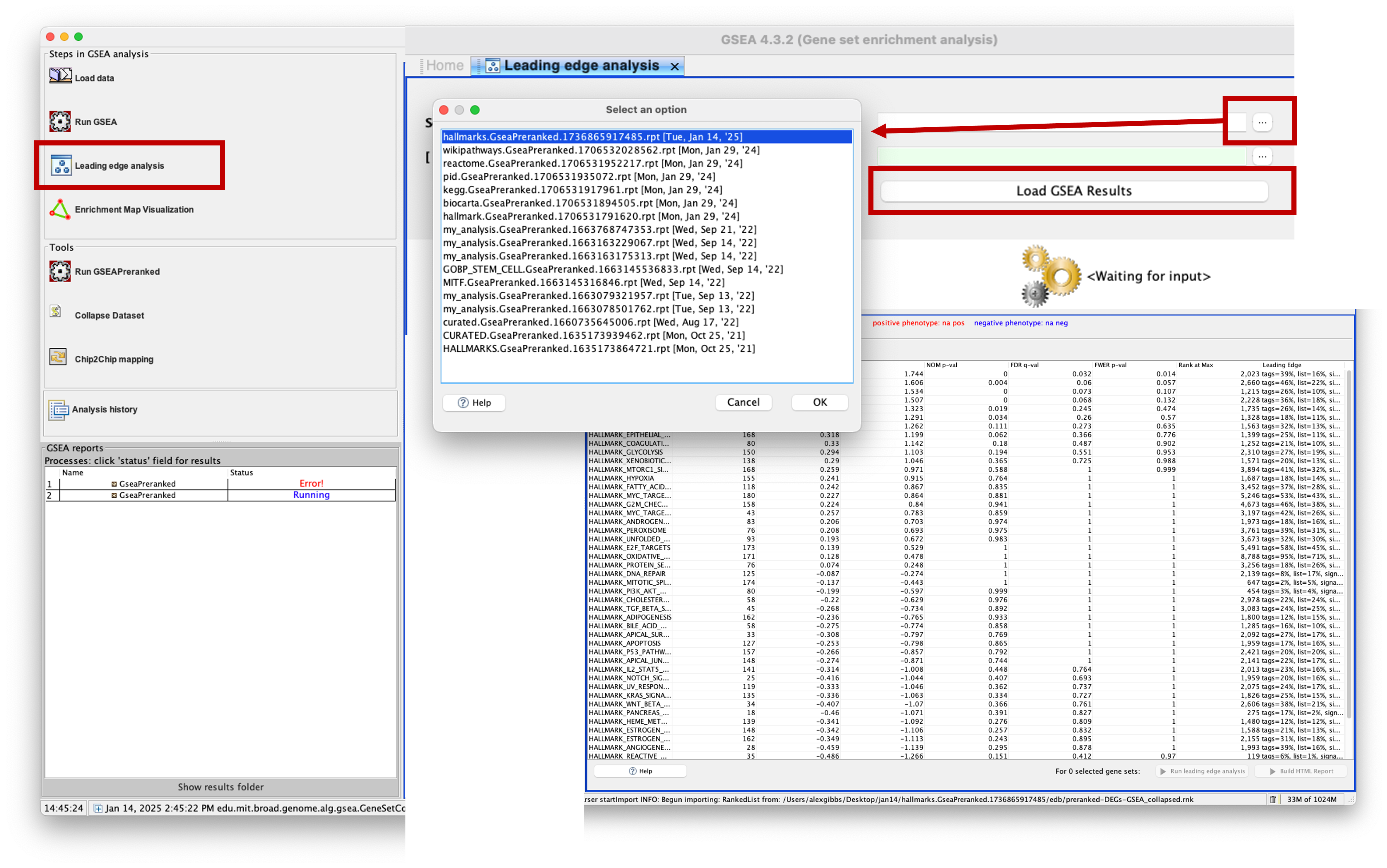
- There are 2 options to load the data: select from the application cache, or select the GSEA results directory.
- As we have run this recently, using the application cache may be easier. But if you have run GSEA ages ago and then want to run this analysis, you may need to select the results directory instead.
- Click on the three dots (…) and a popup window will appear, showing your application cache. Mine contains a fair few from my previous analyses, but the top one is the most recent. You should have only one here. Click on it and then click ‘OK’.
- Now you will see population of the main window of the app with the GSEAPreranked results. To perform the analysis, we need to select which gene sets to use.
- It is completely up to you which ones you select, you may want to select gene sets that are similar to eachother in order to get more meaningful outputs, or you may want to select all of them.
- To select one, click on it. To select multiple, hold down
ctrlorcmdand click multiple. To select them all, pressctrl + aorcmd + a. - With the gene sets selected, you can now do 2 things, run a HTML report or run leading edge analysis.
- I would reccommend clicking on webpage report first, as this requires some compute power. Then click on ‘run leading edge analysis’.
-
You will see that clicking ‘HTML report’ will print the analysis in the ‘GSEA reports’ window on the bottom left, and clicking ‘run leading edge analysis’ loads in the main window.
- The leading edge analysis shows 4 plots. The ones that are most useful are: a heatmap of the DEGs in the leading edges (as columns) and the gene sets they are present in (rows), and a barplot of the genes that are present in the most gene sets.
- Both plots can be saved by clicking ‘File > Save Image’.
- For the barplot, you can use your mouse to click and drag a box over a specific area to zoom in. This allows you to see in more details what genes are involved in X number of gene sets.
- Clicking on the ‘Success’ button of the webpage report in the ‘GSEA Reports’ box will load a webpage of the results.
g:Profiler
- g:Profiler is a web-based tool for functional profiling of gene or protein lists and is one of my go-to tools.
- The tool has a super user-friendly interface and is easy to use.
- To start, load the webpage up using this link.
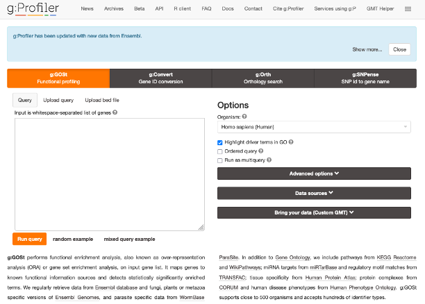
- As you can see along the top, we have 4 tools that the authors have created: g:GOSt, g:Convert, g:Orth, and g:SNPense.
- Clicking on any of these will load the respective tool. We will be using the g:GOSt tool.
- What we actually analyse is completely up to you. I often see that researchers tend to paste the full DEG list into these tools, which is usually fine.
- However, most of these tools don’t have the capacity to split the results into UP- and DOWN-DEGs, meaning that you won’t know what functions are positively- or negatively- regulated in your gene list.
-
This tool can allow for this, though I would reccommend splitting your DEGs into UP- and DOWN-DEGs and then pasting them into the tool separately.
- I will go with the assumption that most of us will only be interested in the positvely-enriched DEGs. Therefore we will just analyse the UP-DEGs from here on.
- Again, this is completely up to you what you analyse. As we have a pretty big dataset, I am going to only analyse DEGs with a log2FC > 2.
- We have already made a file that has the DEGs ordered by log2FC (the file we used in GSEA).
- Let’s duplicate this file, open it, and copy the
gene_ids for log2FC > 2. - Then paste your list into the big white input box on the g:GOSt tool.
- As we are working with Human data, we can keep the
Organismoption as default. If we were working with any other organism, then we would need to change this using the dropdown menu. - As the list we have pasted into the box is ordered from highest-to-lowest log2FC, we can tick the
Ordered Querybox. - The
Ordered Querycan interpret this list by order of decreasing importance. - The incremental enrichment analysis in g:Profiler for ordered queries involves testing increasingly larger numbers of genes starting from the top of the list. This option allows users to determine if functional terms are evenly distributed across the gene list or enriched primarily at the top.
- By running an ordered query, specific functional terms associated with the most significant changes in the experimental setup can be identified, as well as broader terms that characterize the gene set as a whole.
- It’s important to note that the results of ordered queries in g:Profiler should not be treated as p-values. Instead, users should only infer whether genes belonging to a term are evenly distributed across the query or primarily located at the top.
-
I find this analysis is hit-or-miss in terms of understanding what is happening in your gene set.
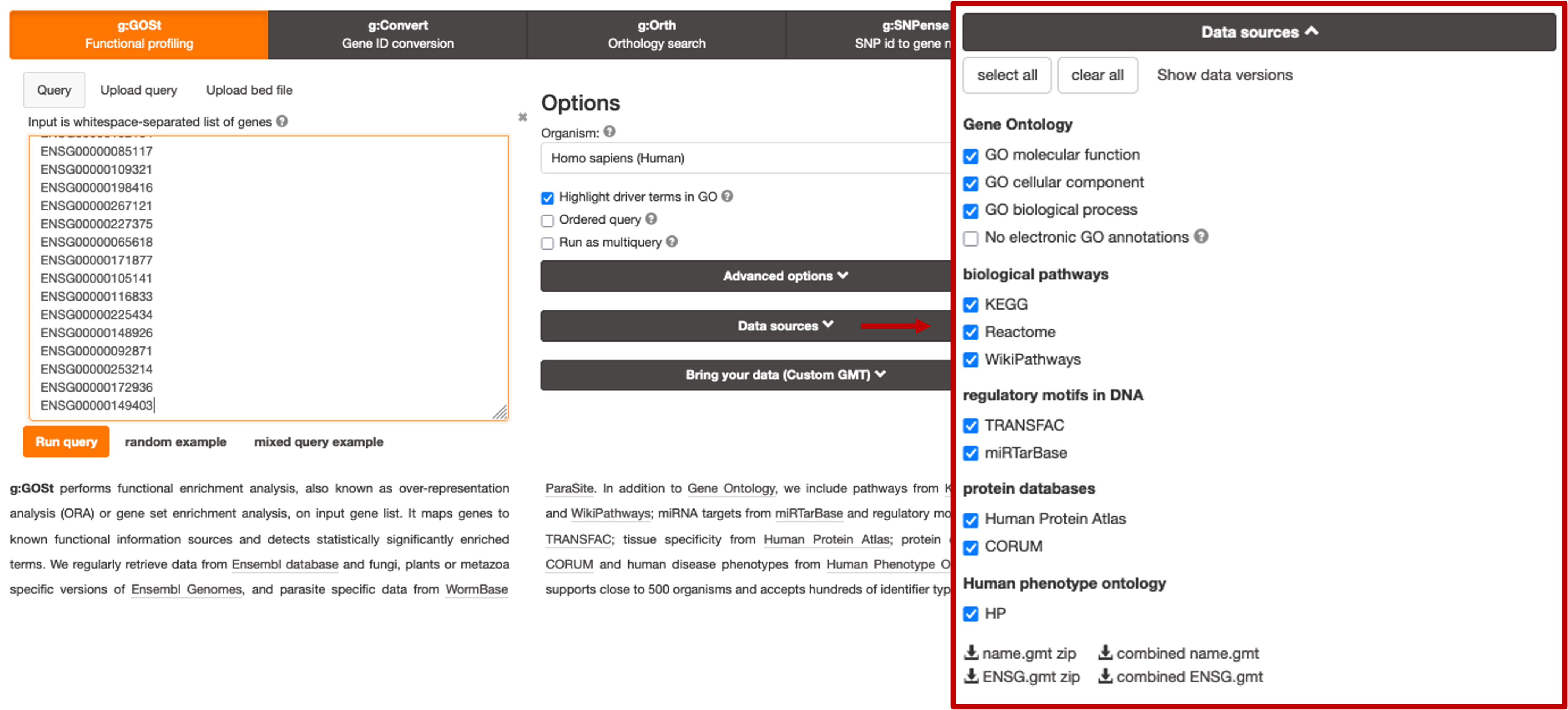
- Instead, I like to start with running the query without ticking the
Ordered Querybox and running the analysis as default. - There are some aditional stuff we can change, such as which data sources to use for the analysis. By default, all data sources are selected, but if you didn’t want a specific one to be used, such as KEGG for example, you can simply click to expand the
Data Sourcessection and untick the corresponding box.
- Let’s continue using the default analysis and click on
Run Queryto start the analysis. - Scroll down to see the results.
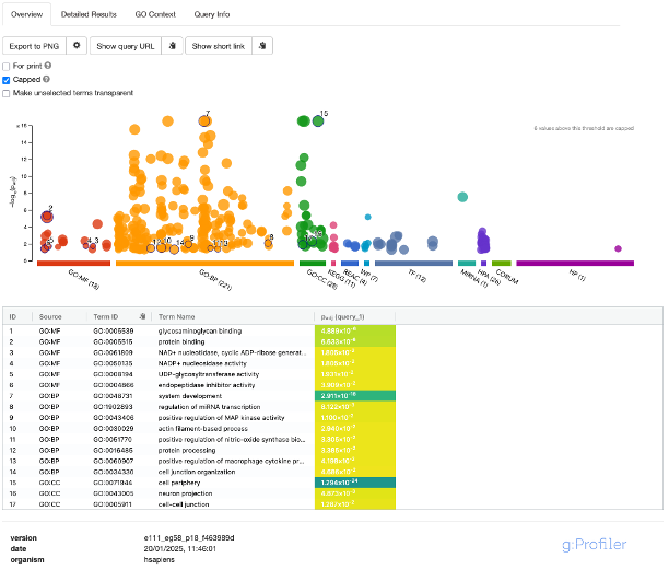
- A nice feature of the results is the Manhattan plot. This plot is interactive. Hovering your mouse over one of the results will tell you more information about it. The number of genes represented by the term is in brackets.
- The X-axis represents functional terms that are grouped and colour-coded by the various data sources.
- The Y-axis shows the adjusted enrichment p-values in a negative log10 scale.
- The circle sizes are in accordance with the corresponding term size. Terms containing more genes have bigger circles.
- The term location on the X-axis is fixed and terms from the same GO subtree are located closer to eachother, making it faster to interpret the results.
- The number in brackets next to the source name on the X-axis denotes how many terms are significantly enriched.
- If we click on a circle of interest to select it, you will see that it is added to the table below the plot. By default, the analysis selects random results to populate this table. To remove selected terms, simply click on them again. Selected terms are also highlighted in the
Detailed Resultssection. -
We can also change the view of the plot by unchecking the
Cappedbox. By default, the analysis caps the plot to only show terms with p-values < 10^-16, which fixes the Y-axis scale to make it easier to compare across terms. Terms below this threshold can also be statistically classed as highly significant. Unticking this box will show results outside of this threshold. - We can also dive a bit deeper into the results by clickin on the
Detailed Resultstab.
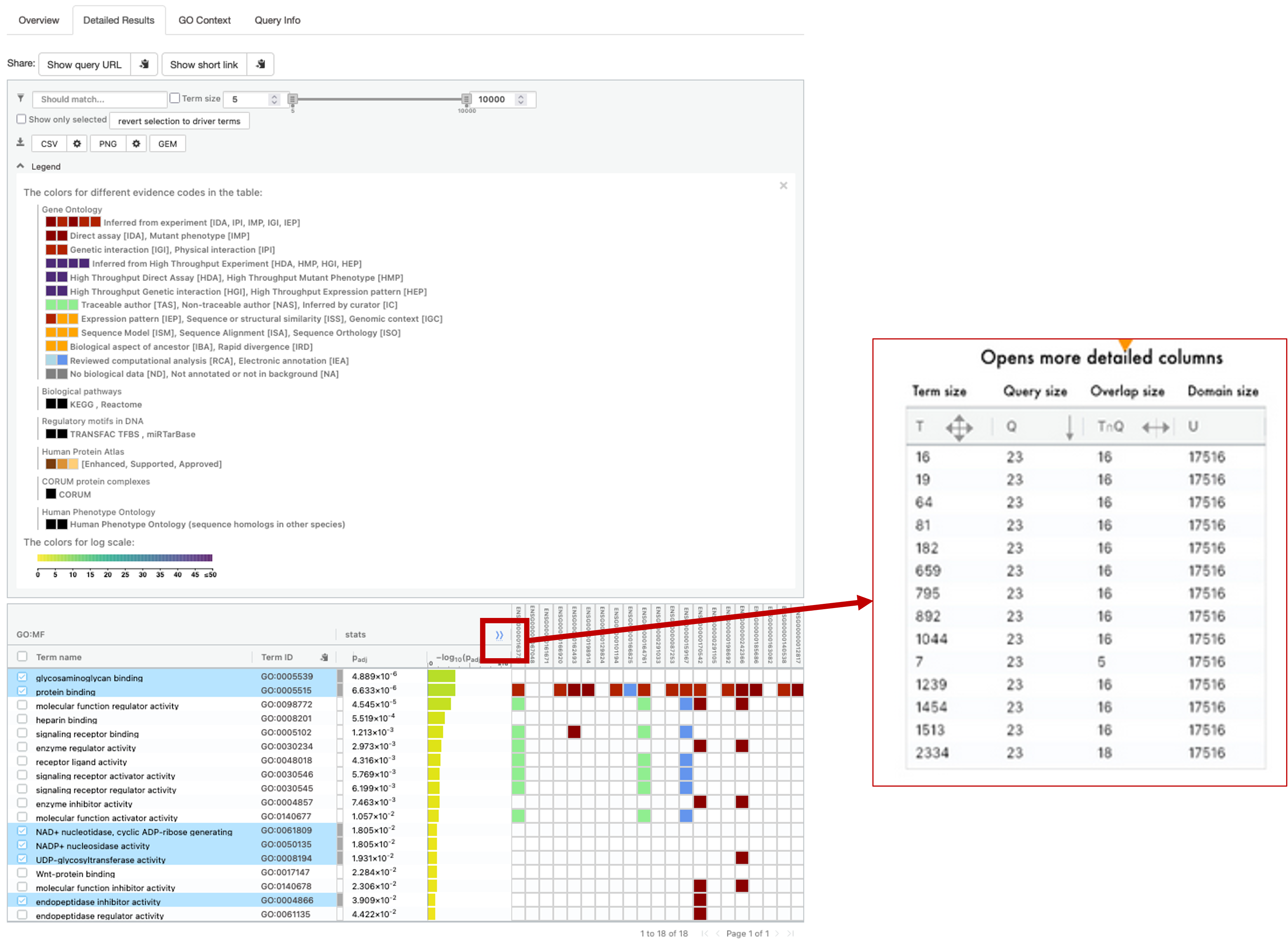
- For the figure above, I have expanded the legend section and also clicked on ‘Show Evidence Codes`.
- This section gives us a more detailed look at the results.
- Clicking the
>>button next to the stats section will expand the table slightly to give us some more information. - T = term size, how many genes are in the term. Q = query size, how many genes we have pasted into the box. TnQ = Overlap size. number of genes in our pasted list that are present in the term. U = Domain size, how many genes in total are present in the database.
Enrichr
- This is another one of my go-to tools for gene list analysis. This tool has been around for ages and the creators at the Ma’ayan lab have been modernising it lately to include some really neat extras.
- Let’s head to the main webpage by clicking this link.
- Here you will see another input box where we can paste our genes, and a box where we can name our analysis/gene list.
- This is the OG Enrichr tool, but you can see below the input box that there’s multiple tools to use: PFOCRummage, L2S2, Rummagene, RummaGEO, Enrichr-KG.
- At the bottom of the page is the Enrichr tool for various other organisms. These tools also provide orthologue conversions.
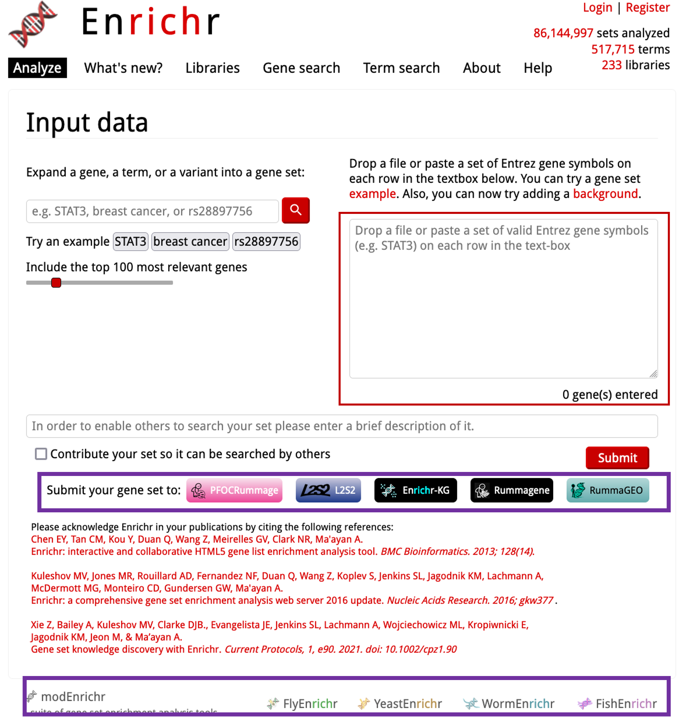
- Enrichr-KG is the new, more user-friendly version of Enrichr. The other tools are separate from Enrichr, but serve as great tools! We will cover these after Enrichr.
- Lets click on
Enrichr-KGto load the new version of the tool.
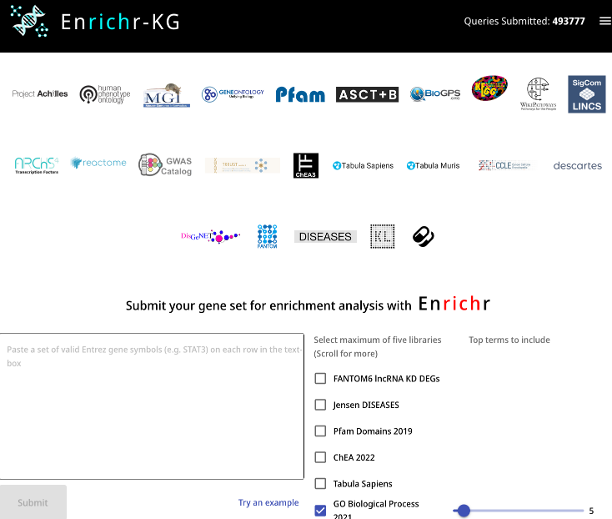
- We have a nice user-friendly interface here. You have a visual representation of the databases that we can use at the top. We can click on these to select them. We can select a maximum of 5 per analysis (you can de-select and select others post-analysis to rerun).
- We need to paste our positive-DEGs into the box as gene symbols. The best way to do this is to open our UP DEGs table we created and copy and paste the
gene_namecolumn. As this list is so big, I would reccommend making a log2FC filter of your choice. Log2FC > 2.5 is common. - Paste the gene list into the input box and then select some of the databases. Then click ‘Submit’.
- Once the analysis has run, scroll down to see a network view of the results. You will see the enriched terms are central nodes and are coloured differently, with the genes in our list that are associated with that term around the outside.
- You can click and drag each node or gene to move it around. Clicking on a gene or node will highlight that interaction or genes associated with the node.
- You may be thinking ‘We gave the tool a load of genes, why is there so little in the results?’ - The tool, by default, will only show us the top 5 processes from each database. To change this, we can click on the ‘Input Gene Set’ at the top left of the page to edit this. To increase the number of results shown, move the sliders next to each respective database and then click ‘Resubmit’. Note: Increasing the number of results will cause the browser to get slower and/or could crash it.
- Clicking the ‘Legend’ icon will give you a legend, showing the colours assigned to each database nodes.
- We can also see a tabluar format of the results by clicking on ‘Table View’ along the top. Here, you can see the stats of the analyses as well.
- You can visualise the table by clicking on ‘Enrichment Bar Charts’.
- Now we can take a look at the other tools by this team.
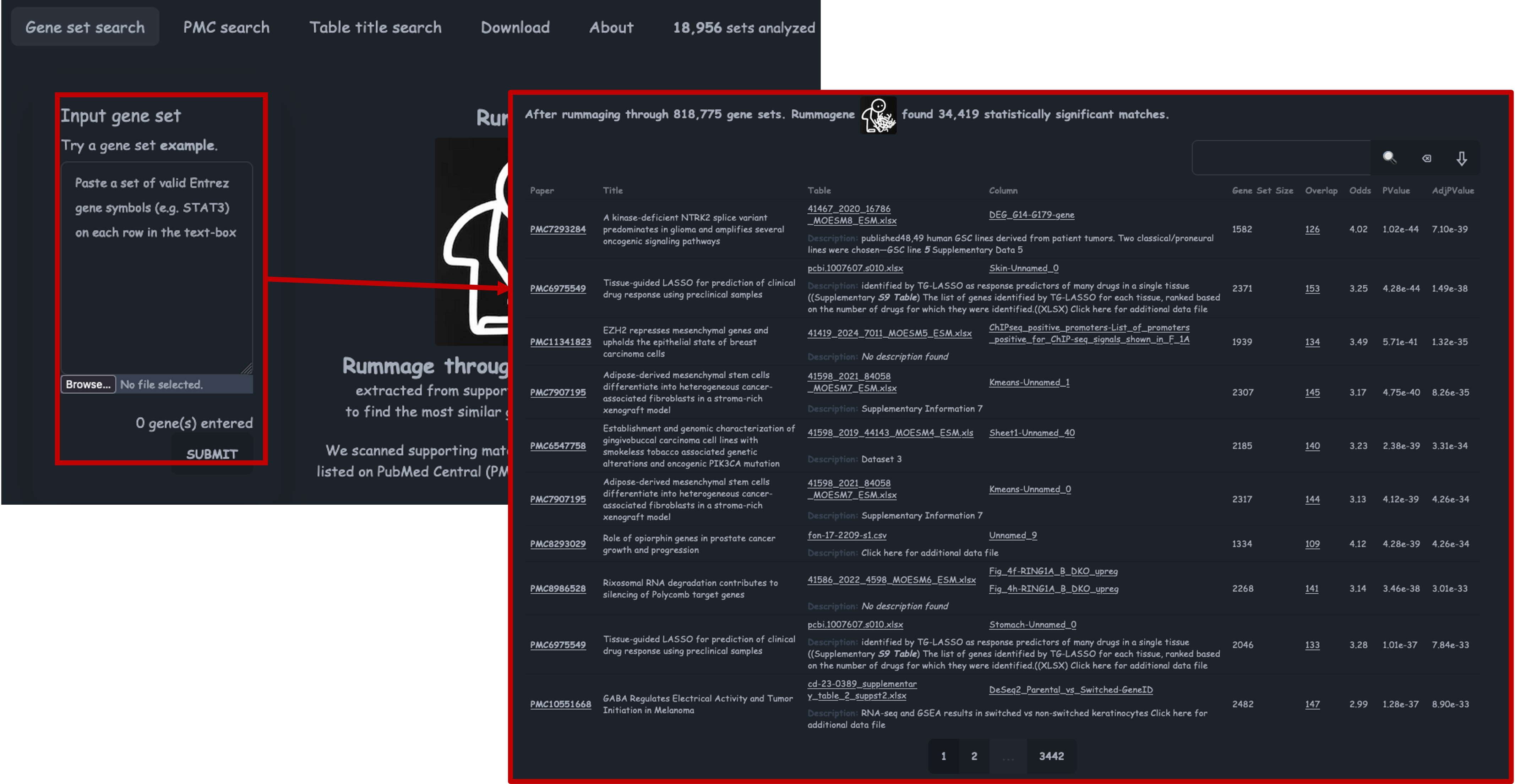
Rummagene
- If we follow the link, you will find the Rummagene tool, or the Pathway Figure Optical Character Recognition tool.
- Rummagene was the first of the rummager tools develped by the Ma’ayan lab.
- It takes your genes as input and rummages through > 800,000 supporting tables from papers to find the most similar gene sets that match.
-
This can be a really useful tool if you are trying to find simliar research to yours. I also find this is a helpful tool for study confirmation, i.e. If I sequenced keratinoytes, my DEGs should be enriched for keratinocyte markers which should then show up in the results of this tool.
- Lets paste our genes into the tool and click ‘Submit’.
- The Gene Set Size refers to the size of the gene set from the figure that it has compared to. Overlap refers to how many of our inputted genes are found in that gene set. Odds refers to the odds ratio, which measures the strength of the association between the interactions, a higher ratio indicates a stronger association. We also then have the P value and adjusted P values.
PFOCRummage
- If we follow the link, you will find the PFOCRummage tool, or the Pathway Figure Optical Character Recognition tool.
- This nifty tool takes your gene list and rummages through > 52,000 gene sets that have been extracted from > 44,000 articles.
- As the name suggests, these gene sets have been extracted from publication figures.
- To get going, lets paste in our gene list (as gene symbols) into the box and click ‘Submit’.
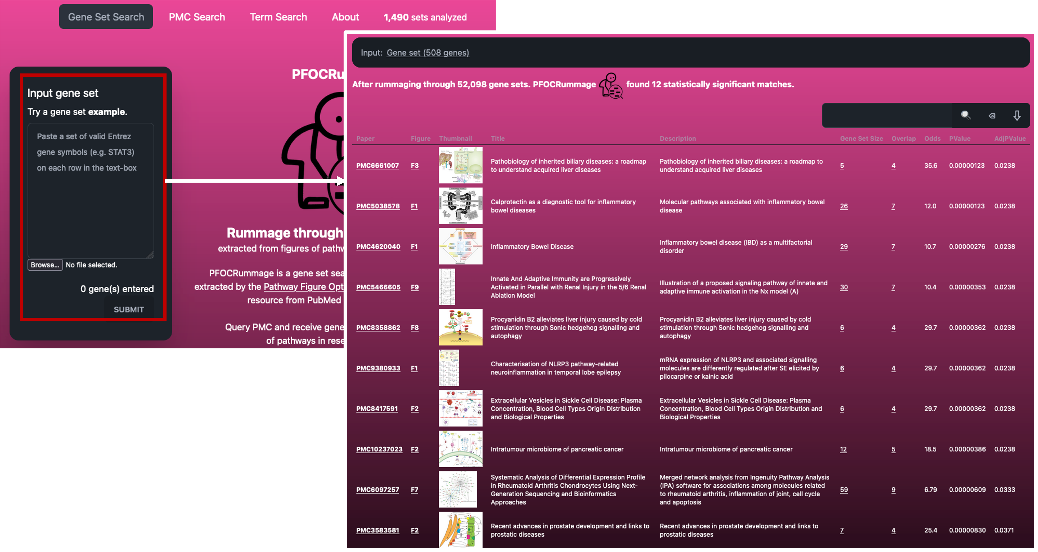
- The results can be really neat if you are looking for similar papers/datasets to yours.
- The software also provides us with the same stats as Rummagene.
RummaGEO
- If we follow the link, you will find the RummaGEO tool.
- GEO currently only supports searching of metadata describing studies and samples to locate relevant studies.
- This tool allows users to search gene expression signatures against all human and mouse RNAseq studies that have been deposited in GEO.
-
The database currently contains > 178,000 human and > 200,000 mouse gene sets from > 30,000 GEO studies.
- Let’s paste our DEGs into the box and click ‘Submit’.
- The results are really useful for finding similar datasets to ours. As you can see, the top results are actually from the GEO dataset that we have used for this course.
- The results are accompanied by some stats and information about the resulting datasets.
- The stats are the same as Rummagene, with the addition of the Silhouette Score, which is a data-level confidence score of the condition groups. This is based on a PCA of normalised expression data. A value of 1 indicates perfect clustering and -1 indicates poor clustering.
Paid Tool - Ingenuity Pathway Analysis (IPA)
- Cardiff University has a licence for IPA which users can pay to have access to.
- This is a brilliant tool which I use all the time!
- I won’t be doing a live demo, as we will be here all day, but I will brush up on some of the features.
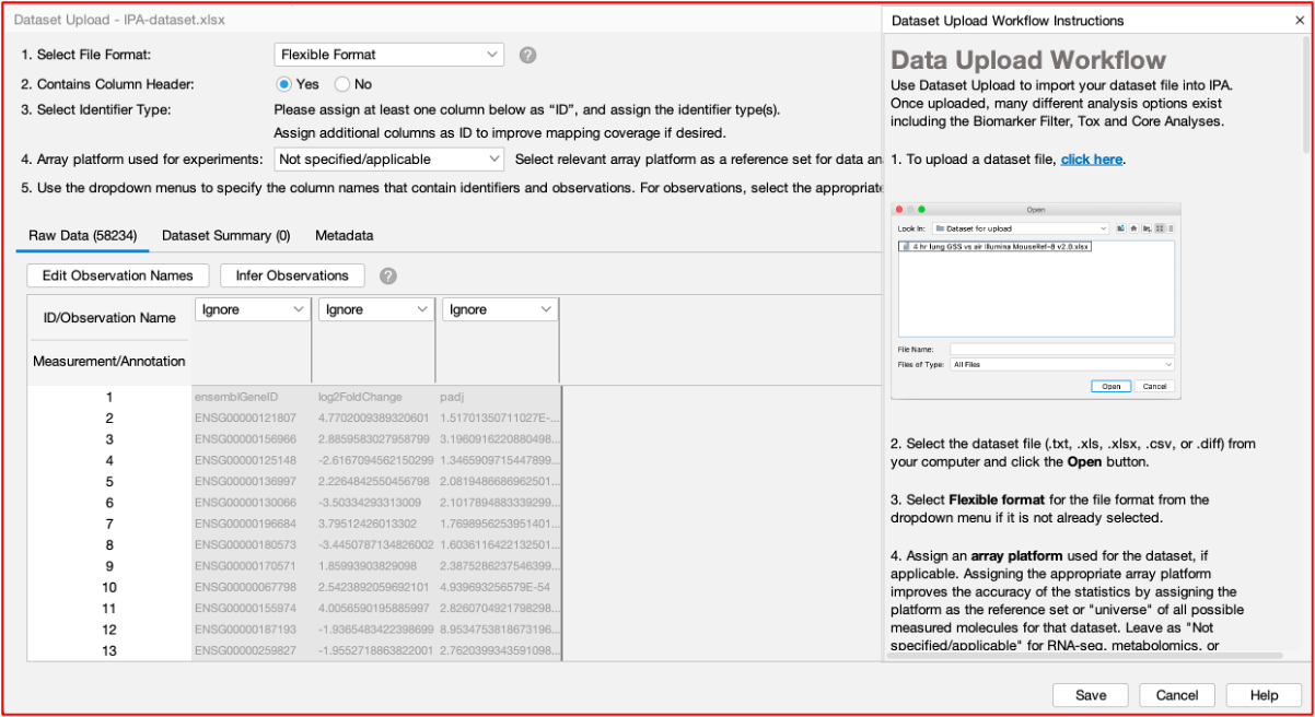
Data Upload
- You can upload your data table(s) ‘as is’. The software has an ‘Infer Observations’ feature that reads the table and predicts which columns you want to perform your analysis on.
- Sometimes it gets it wrong, but this is a handy feature. For RNAseq data, we need to use the log2FC and adjusted P value columns for analysis.
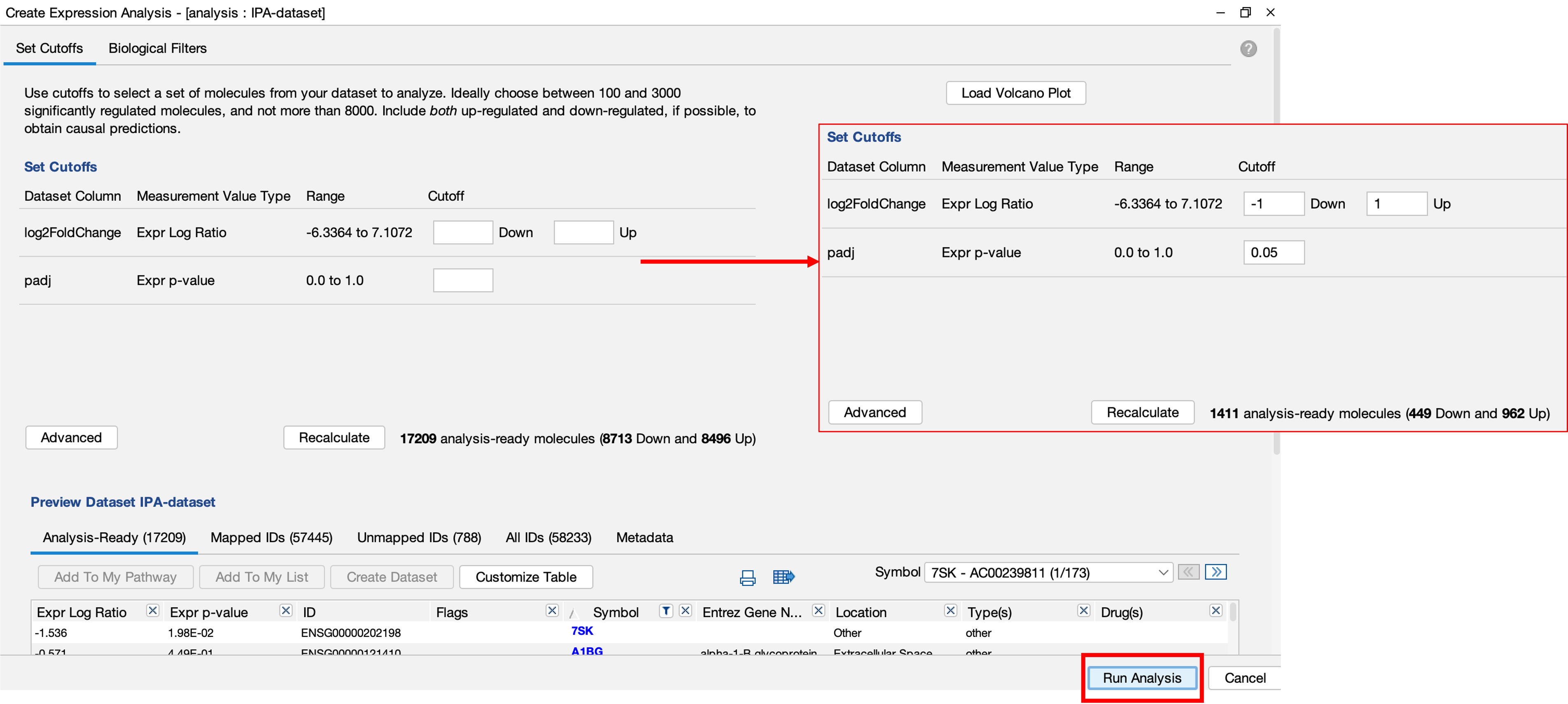
Upload for Analysis
- Then we can upload the data to their cloud servers for analysis.
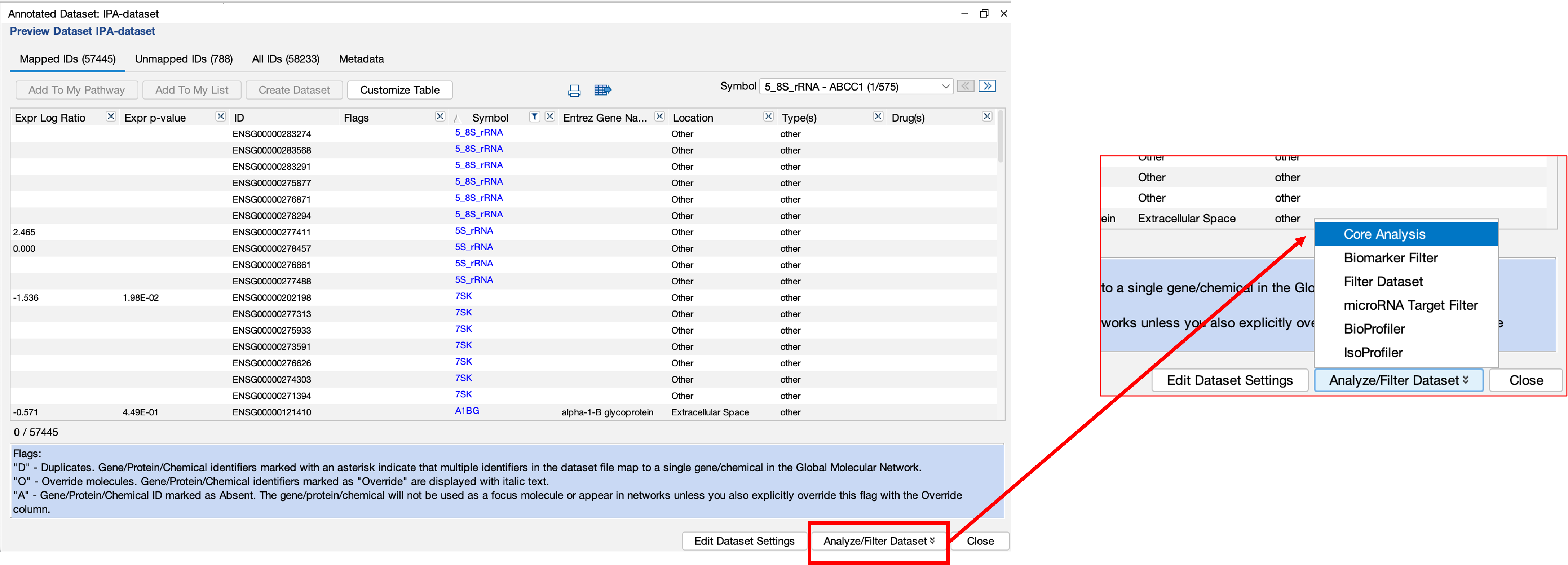
- The handy part here is that we can then choose to filter the data before uploading. This means that we don’t have to bother filtering our data before-hand which can save you a load of time!
Results
- Once the analysis has been completed, you will be notified by email.
- Upon opening the results, you will be greeted by a summary page.
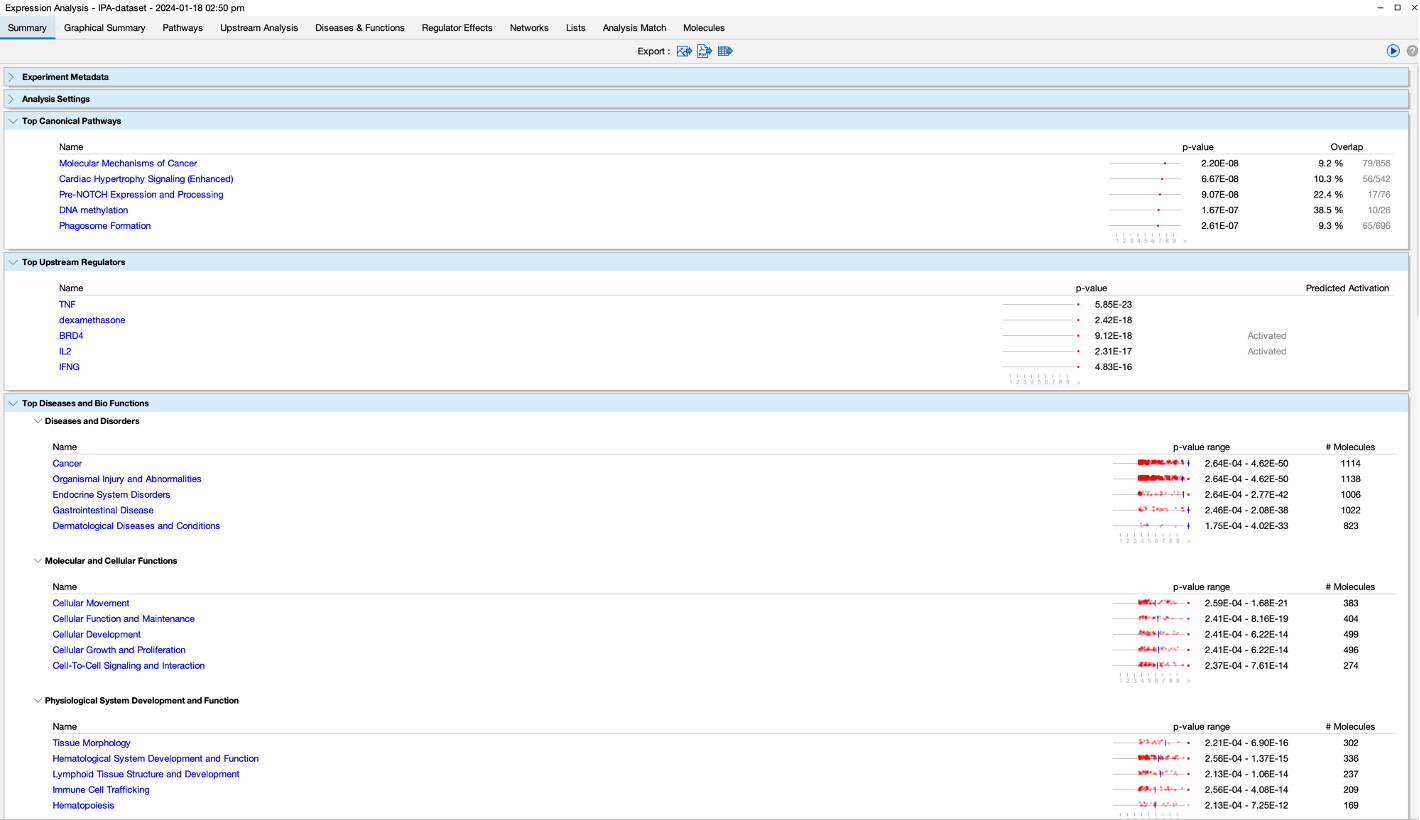
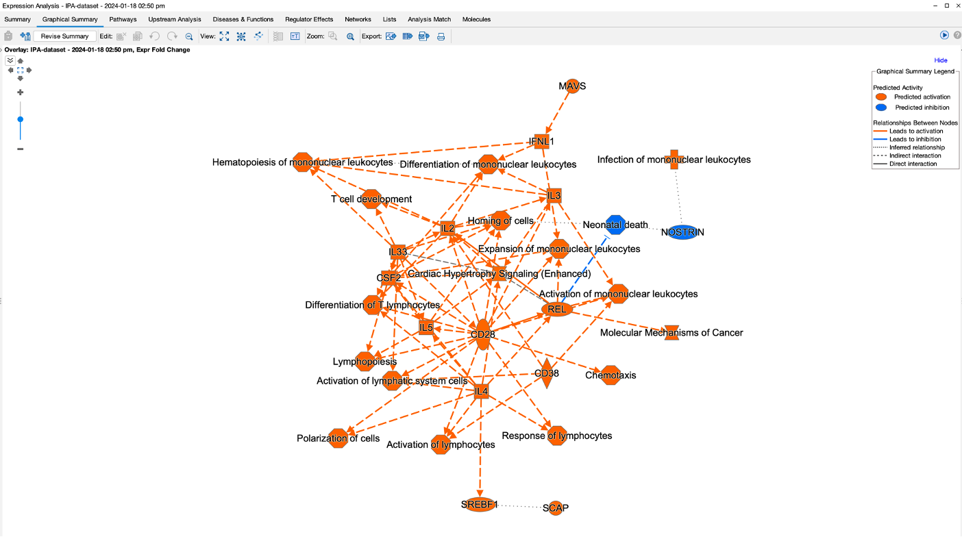
- There is also a graphical summary page which provides a network summary of the results. The purpose of this network is to give you a quick overview of the major biological themes in the analysis.
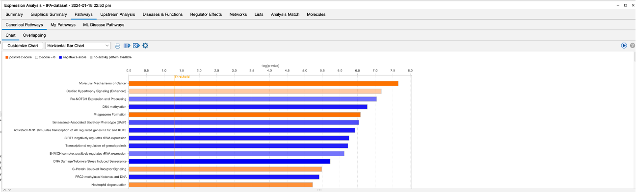
- The Pathways section gives us a detailed look at all of the pathway results. We have options here to change the look of the graph, too. There is also an option to see the machine learning disease pathways.
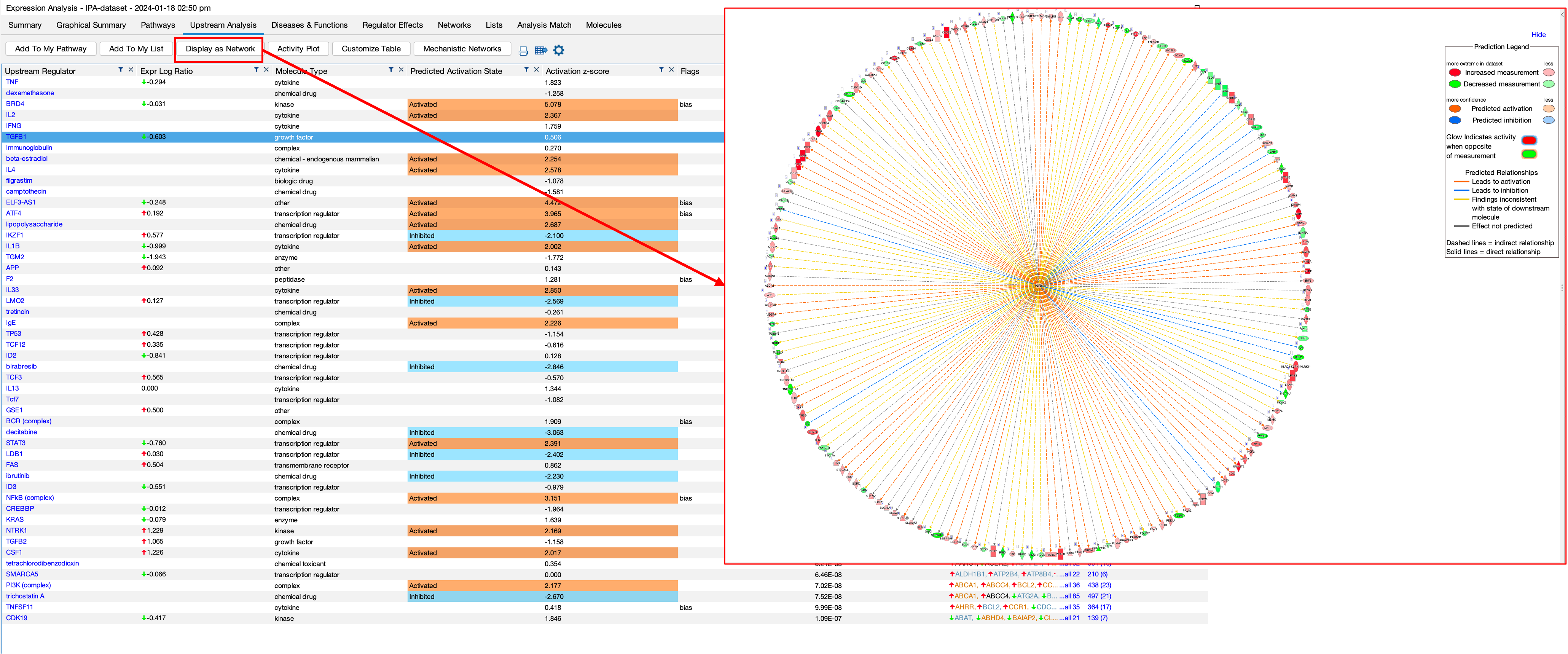
- The upstream regulator section shows us the results of the upstream analysis that the software performs. The aim here is to identify any ‘molecules’ that are upstream of the dataset that may have an influence. The software also provides activation z-scores for each molecule. Z-scores combine expression and significance. a positive Z-score indicates activation, and the higher the score indicates the degree of activation. The same thing applies for negative z-scores.
- You can see from the figure that the software highlights molecules that it believes are activated or inhibited outside of the dataset which may then be causing the changes in our dataset.
- You can also dive deeper by selecting a results and then clicking on ‘Display as Network’, which shows us the selected molecule in the middle on the network and its interactions with our DEGs.
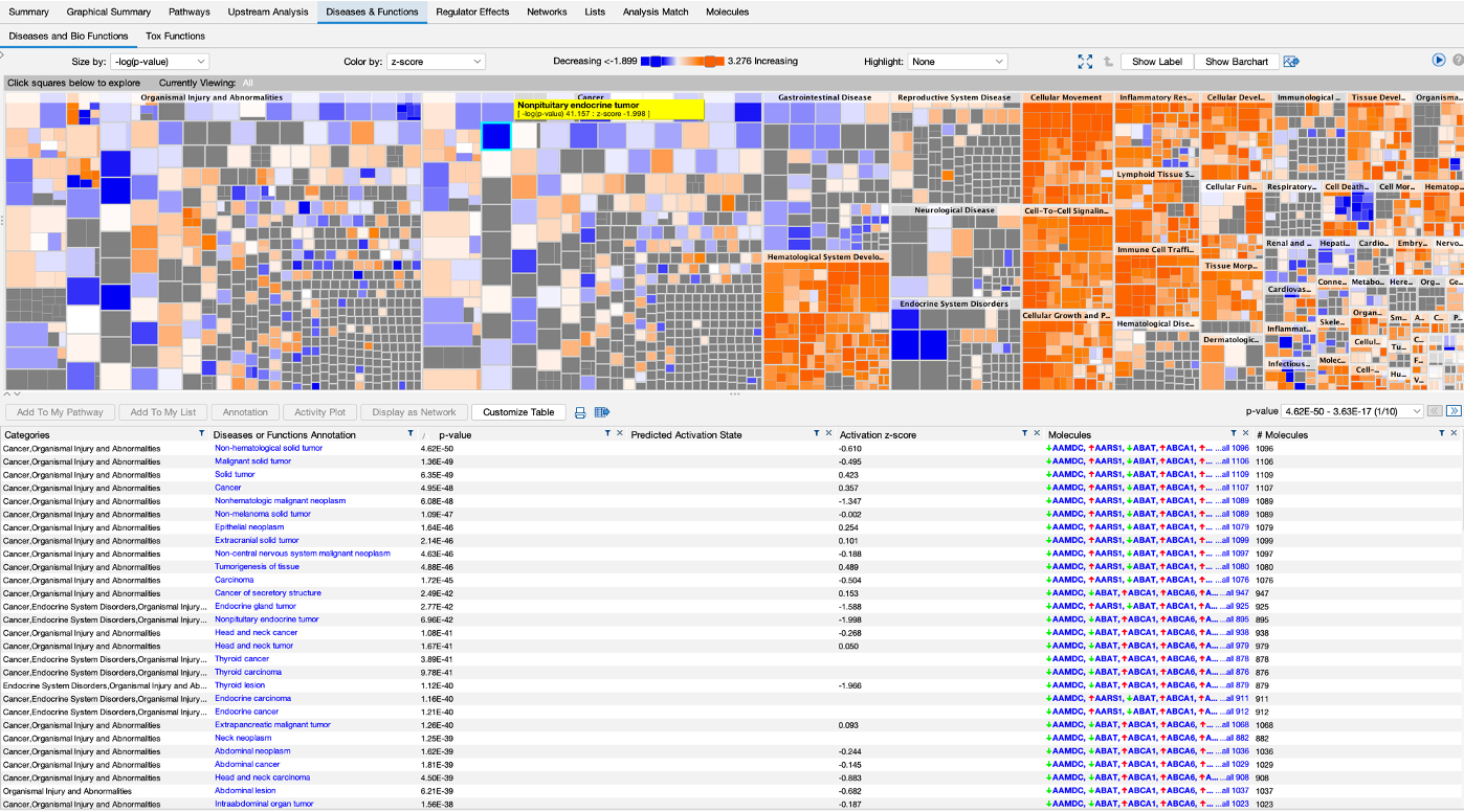
- Then theres the disease and functions section that shows us all of the disesases and functions that are up or down in our datasets.
- We can dive deeper into this visualisation by clicking on the boxes.
- A table of the results is also below. We can also display one of the results as a network by highlighting one and selecting ‘Display as Network’.
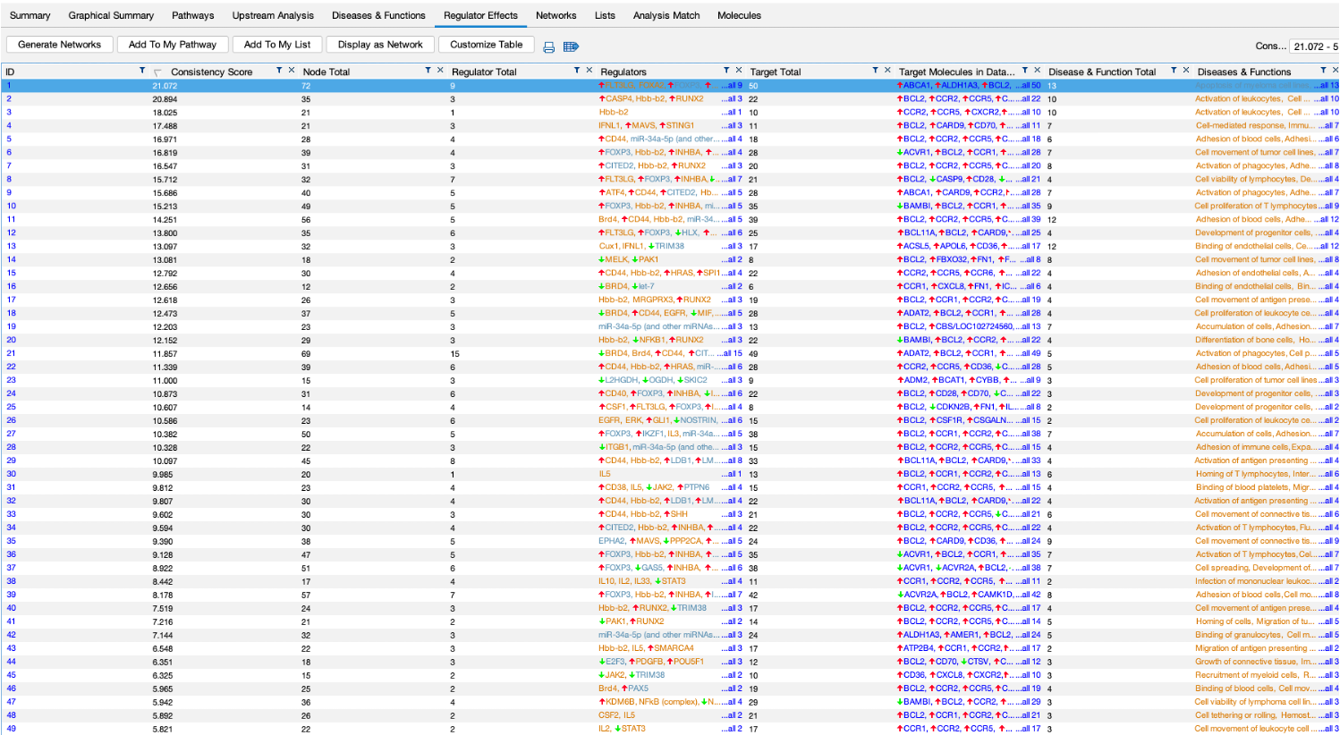
- We also get a regualtor effect analysis, which is a table of predicted regulators of our dataset.
- Again, clicking on a regulator and selecting ‘Display as Network’ shows you a detailed network.
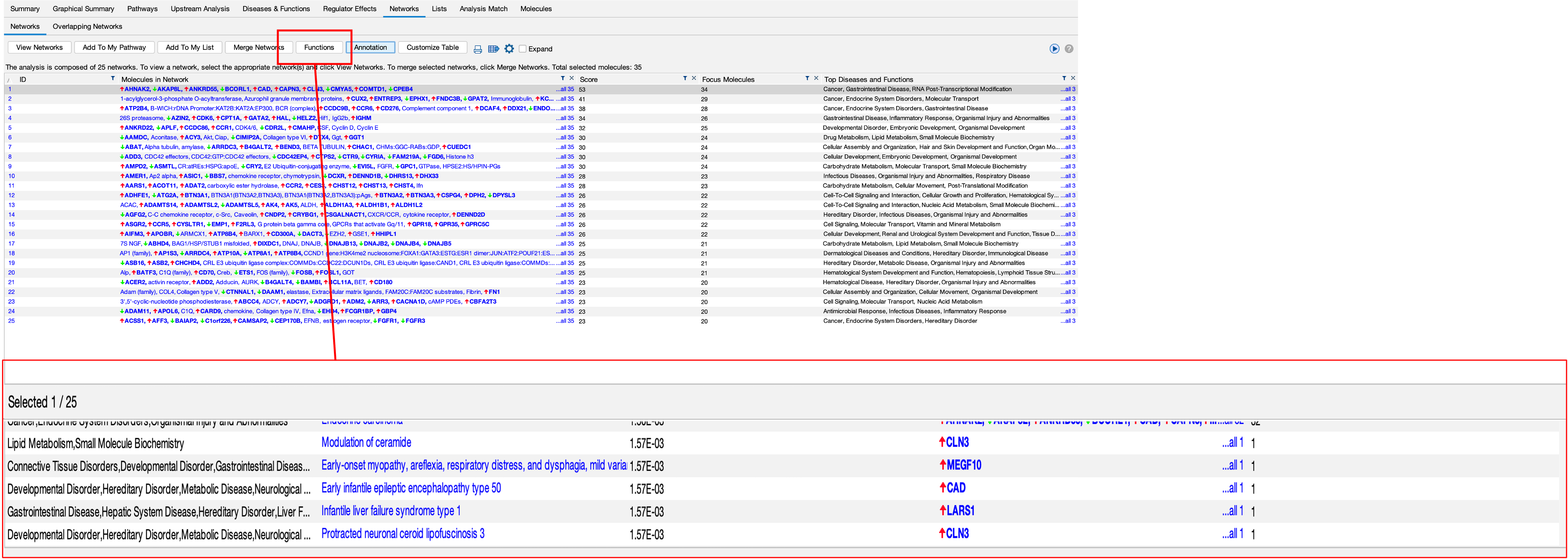
- The software also attempt to create networks of genes from the DEGs we provide, these can be seen in the networks section.
- You can view these networks by clicking on ‘View Networks’.
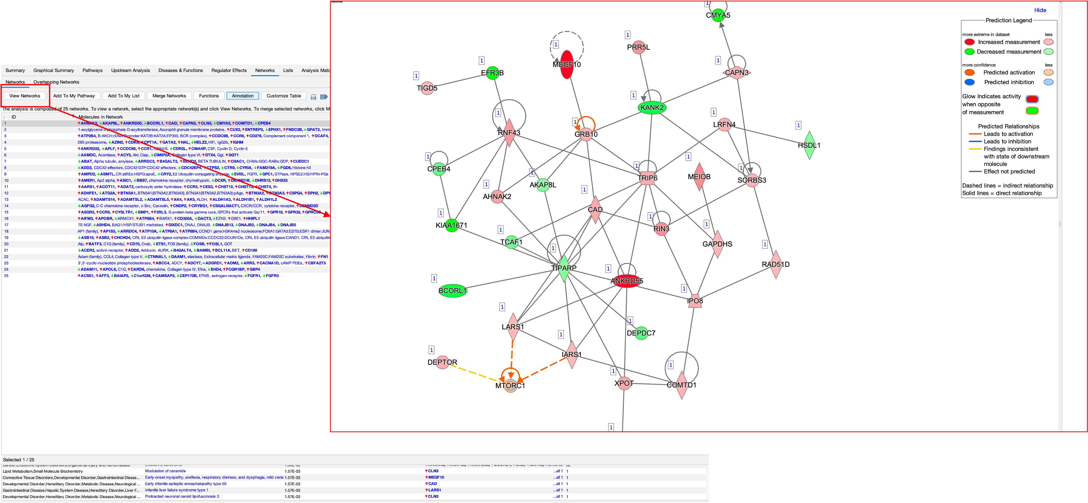
- You can also see what these networks are involved in by clicking on the ‘Functions’ button.
- We can also do a biomarker analysis, which analyses your DEGs for potential biomarkers
- This can be a handy tool, as you can use filters to return a list of desired feature. For example, if you wanted to identify cell surface markers in your DEGs, you can use the filter to do this.
- We can also use the software to search for our favourite gene/pathway/disease.
- In the example here, we have searched for a pathway. In the results, we clicked on the pathway which loaded up the pathway diagram.
- We can go one step futher here also, by overlaying our DEGs onto the pathway using the overlay.
- Here you can see on the left tab, what DEGs are present in this pathway and their expression.
- We can also see on the diagram where they are.
- Lastly, there is also a build tool that allows us to build, using IPA’s knowledge base, on top of our gene(s).
- For instance, if you wanted to see what a particular gene binds up/downstream to, you can use the build tool to do this.
- Or if you wanted to find a connection between two genes, the build tool can also do this.
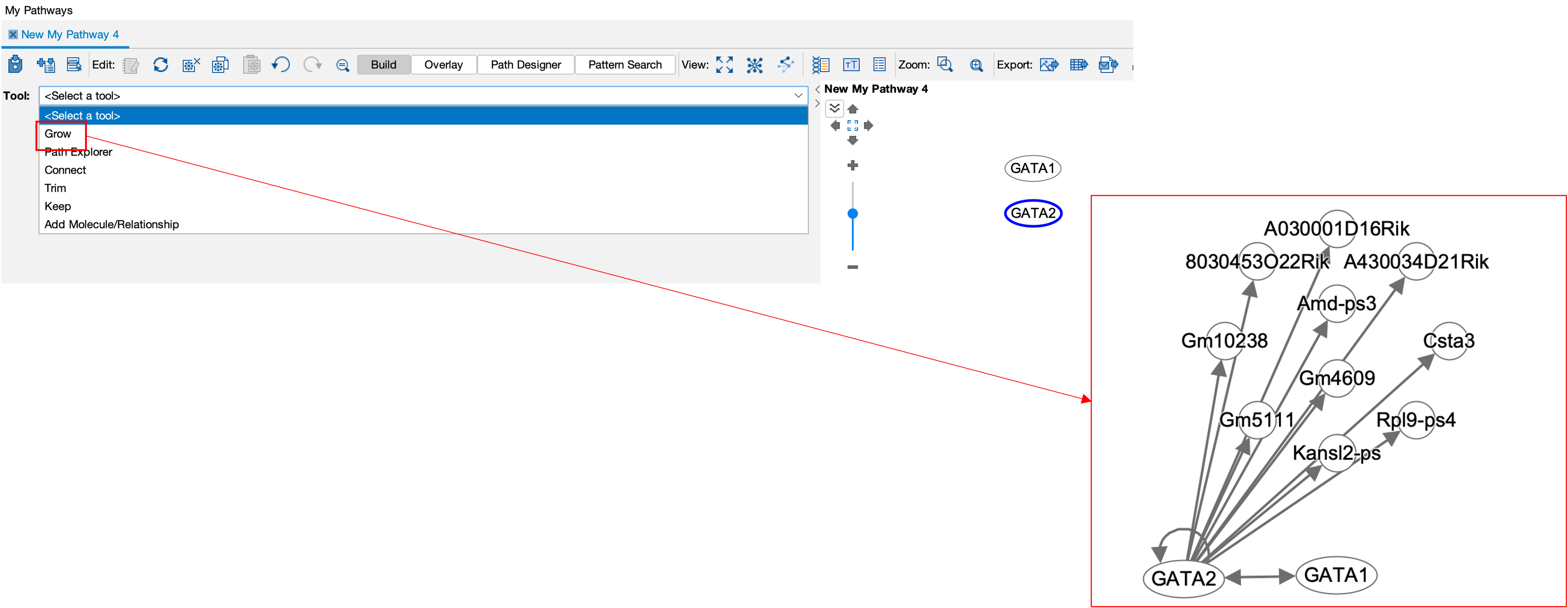
- Take an example of GATA1 and GATA2 genes. I have searched for both and added them into a new pathway.
- From there, I selected both, then selected the build tool and then selected the connect sub-tool.
- From here, I am given multiple parameters such as up/downstream binding, or both, species, diseases etc.
- Then running the tool shows that there is indeed a connection between the 2 genes. Connections are also accompanied by evidence, here you can see E and PD, meaning expression and protein-dna binding.
- I can also then use the grow sub-tool to see what GATA2 interacts with.
- As you can see, there are many many tools available in IPA to assist you in your analysis.
Other Tools
- There are many many more toos available to analyse your DEGs!
- I have collated a growing list of tools for you to check out.
- I have also made videos and tutorials for a few of these tools, so be sure to click on the links.
Thank you for taking part in the course. For those of you who have made it this far and would like to see video recaps of the whole course/process, please click here. This link will take you to Panopto video recordings of each process.